I thoroughly enjoyed my time working with Farhan and came to know him as a truly valuable asset to our team. He is dependable, and incredibly hard-working. Beyond that, he is an impressive UX/UI designer who delivers best quality of work within tight deadlines. His knowledge of UX/UI design and expertise in providing full set of assets was a huge advantage to our busy workload.
Along with his undeniable talent, Farhan has always been an absolute joy to work with. He is a true team player, and always manages to foster positive discussions and bring the best out of even the most complex projects.
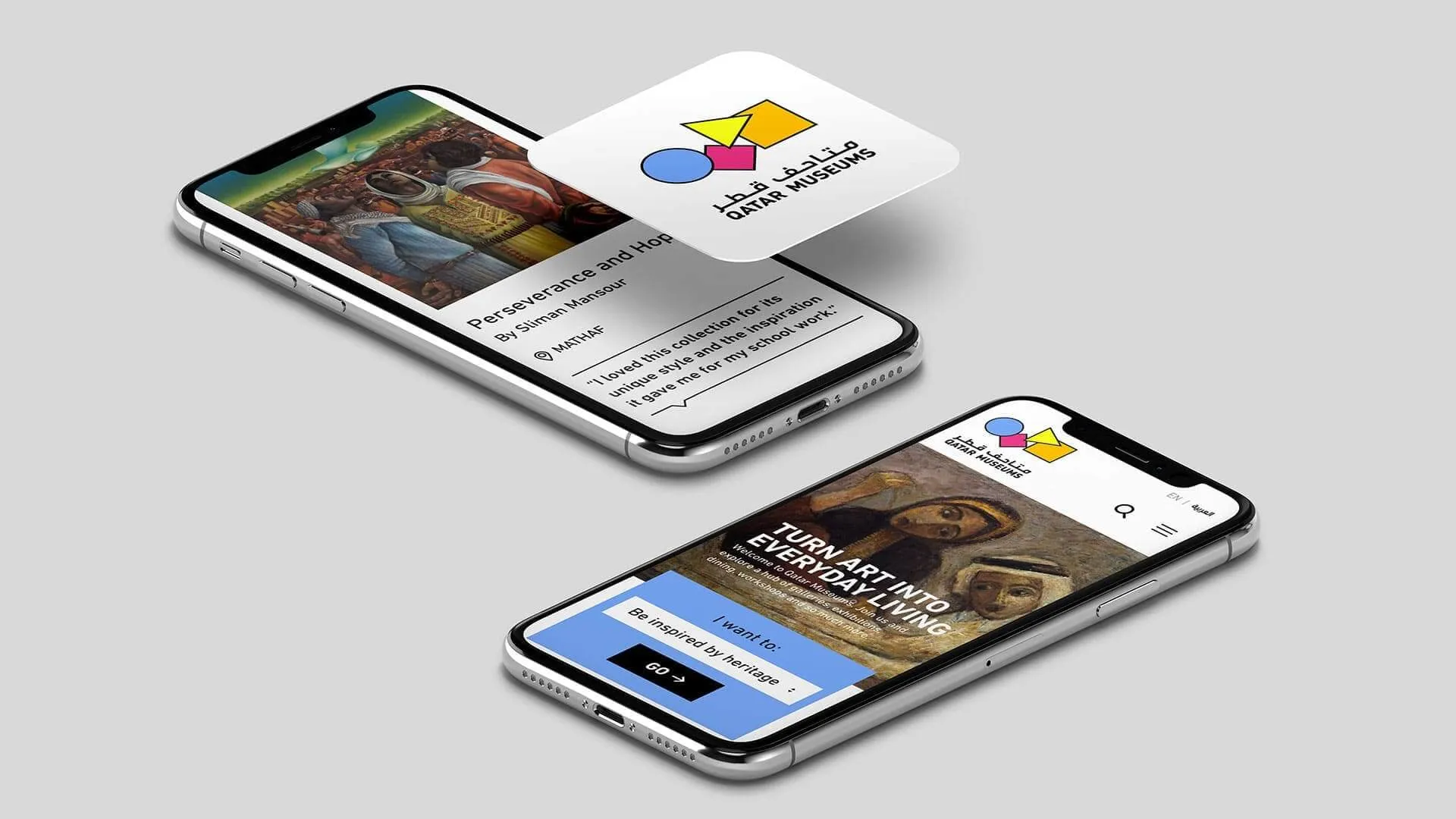
Exploring two digital directions for Qatar Museums as part of an MRM//McCann pitch.
Qatar Museums wanted to explore new ways of presenting its exhibitions, events, artists and cultural content online as part of an RFP led by MRM//McCann.
I designed two distinct UX/UI directions for the website, exploring how each could work across homepage, inner pages, desktop, tablet and mobile while working closely with the MRM//McCann team.
My role
UX/UI Designer
Project for
Qatar Museums
Worked with
MRM//McCann
The challenge
The pitch needed two genuinely different ways to imagine Qatar Museums online
The work needed to give MRM//McCann distinct creative options for the pitch, rather than variations of the same design.
At the same time, the two directions could not just be attractive homepage concepts. Each direction needed enough structure to show how Qatar Museums could present exhibitions, events, artists and cultural content clearly, and how the idea could carry through to inner pages and smaller screens.
Creative direction 1
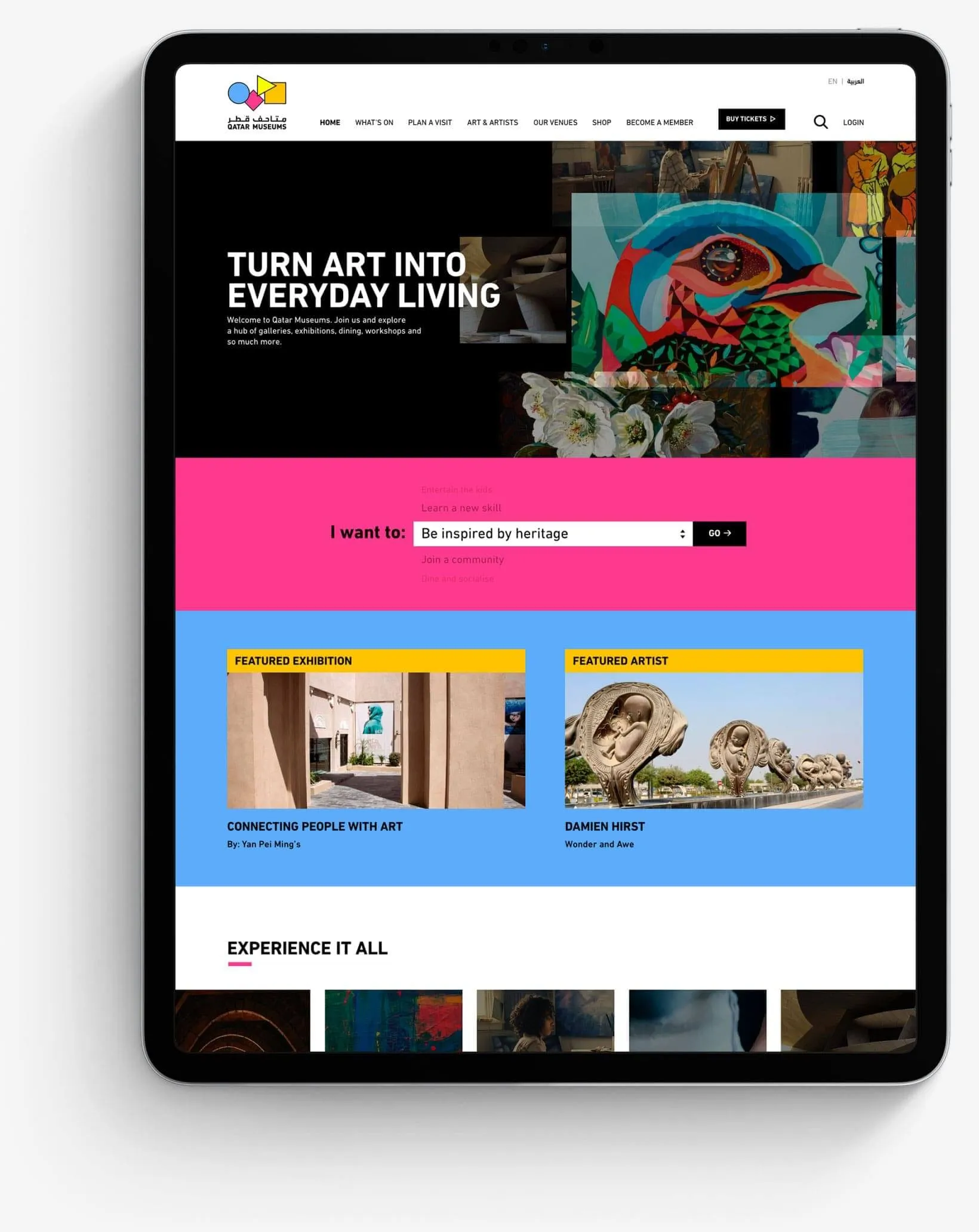
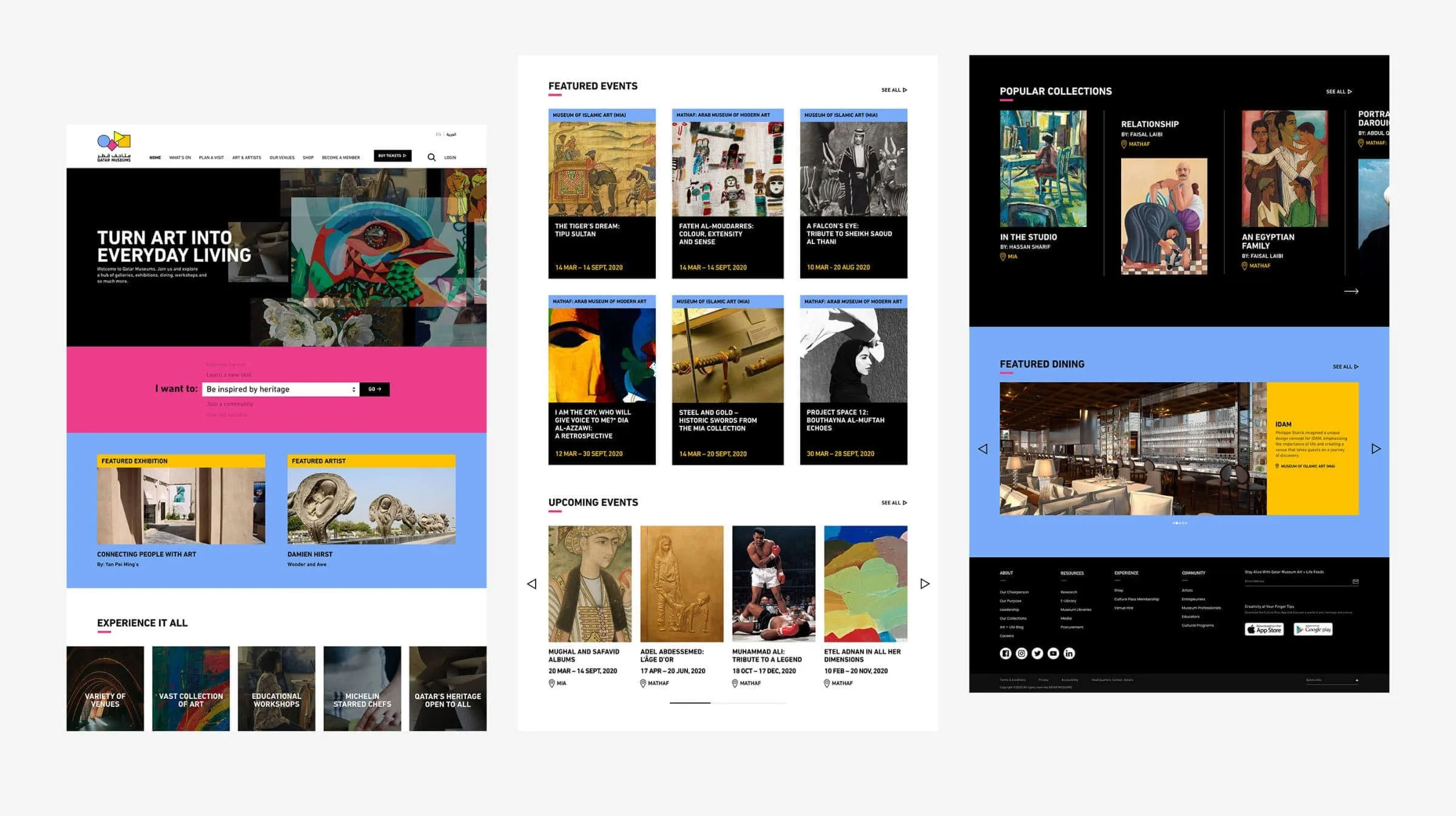
A structured direction that puts exhibitions, events and artists at the centre
The first direction used a clear, structured layout with colour playing a bigger role in separating and highlighting content.
The idea was to make exhibitions, upcoming events and featured artists easy to discover, while giving Qatar Museums enough flexibility to bring different stories and cultural content forward across the site.
Creative direction 2
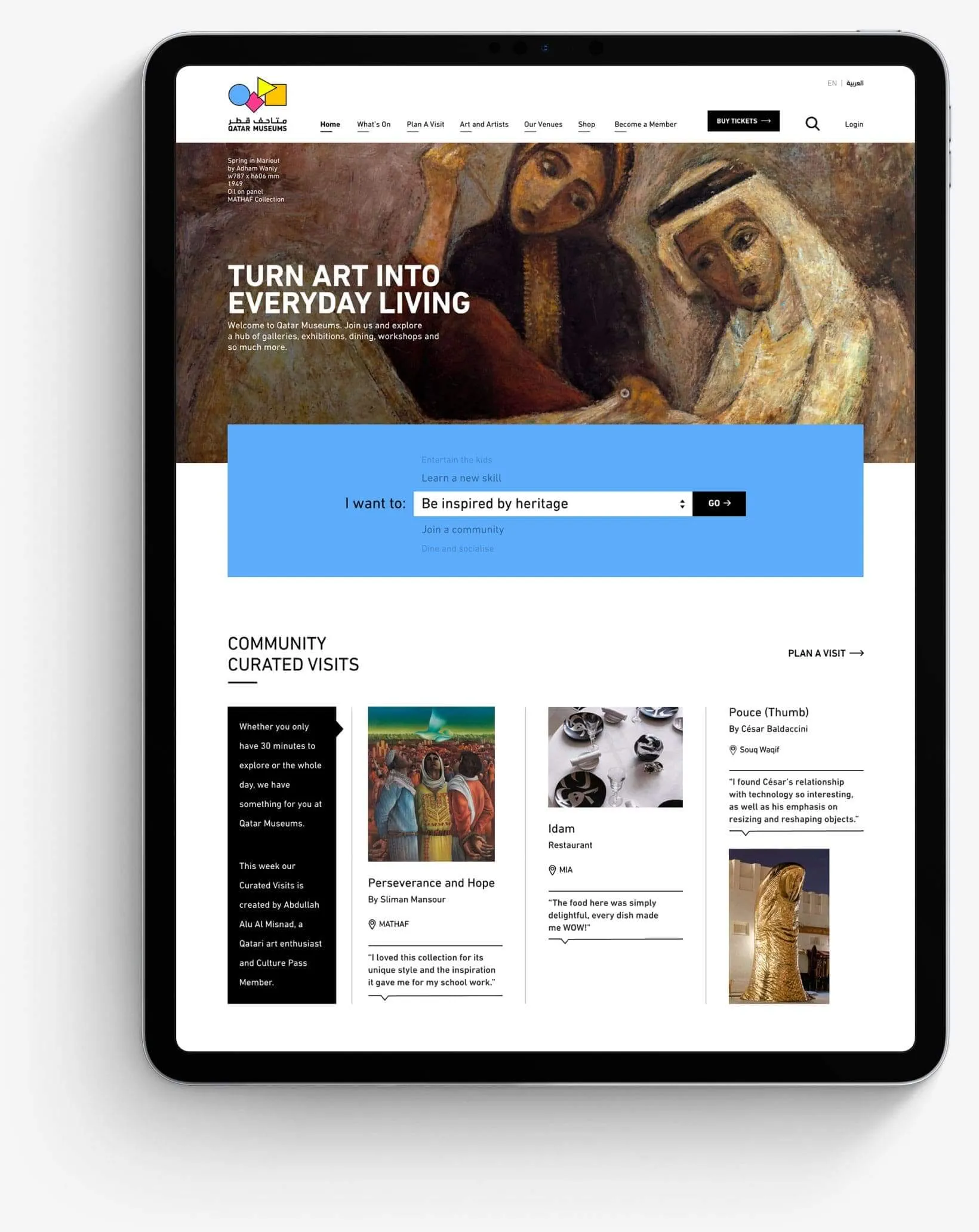
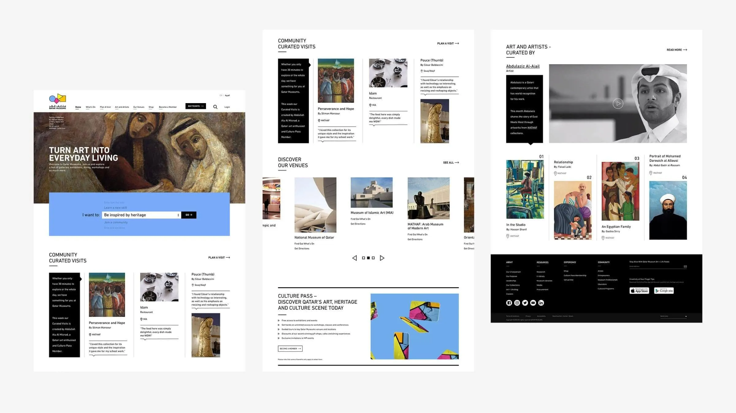
A more expressive direction that lets the artwork shape the experience
For the second direction, I pushed the visual approach further. The layout was more expressive, using stronger composition and imagery to give exhibitions, artists and their work more presence.
It gave MRM//McCann a clearly different option for the pitch while still keeping the content organised and the experience practical across the wider website.