Designing one talent platform for employees and government leaders.

Talent Hub was created to bring workforce data from across Abu Dhabi Government into one place, helping teams understand talent, skills and people across a large organisation.

I led the UX and UI design across the web platform, working closely with the product, strategy and development teams to turn complex workforce data into clear dashboards, profiles and search experiences.

My role

UX/UI Lead

Project for

Abu Dhabi School of Government

Worked with

American Eagle

The challenge

Two very different views of the same talent data

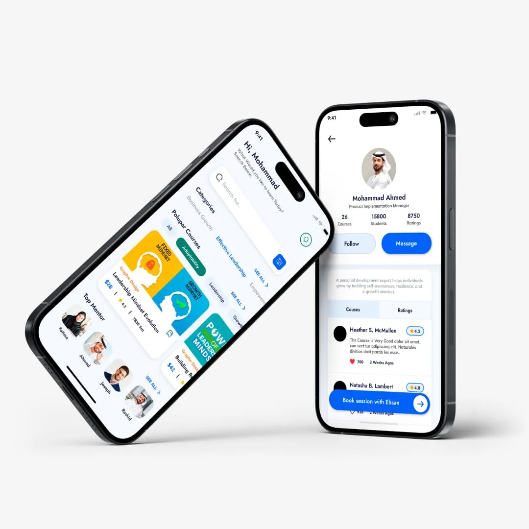
Talent Hub had two sides to it. For individuals, it needed to feel personal and useful — helping them build a profile, understand their skills, find opportunities and decide what to do next.

For senior government leaders, the same platform needed to work at a completely different level. They needed to explore the wider talent pool, understand performance across teams and ministries, and identify the right people for specific needs.

My role was to lead the UX/UI across both sides and make sure they felt like parts of the same product, rather than two separate tools sharing the same data.

Building the talent profile

Building a useful profile without asking for everything

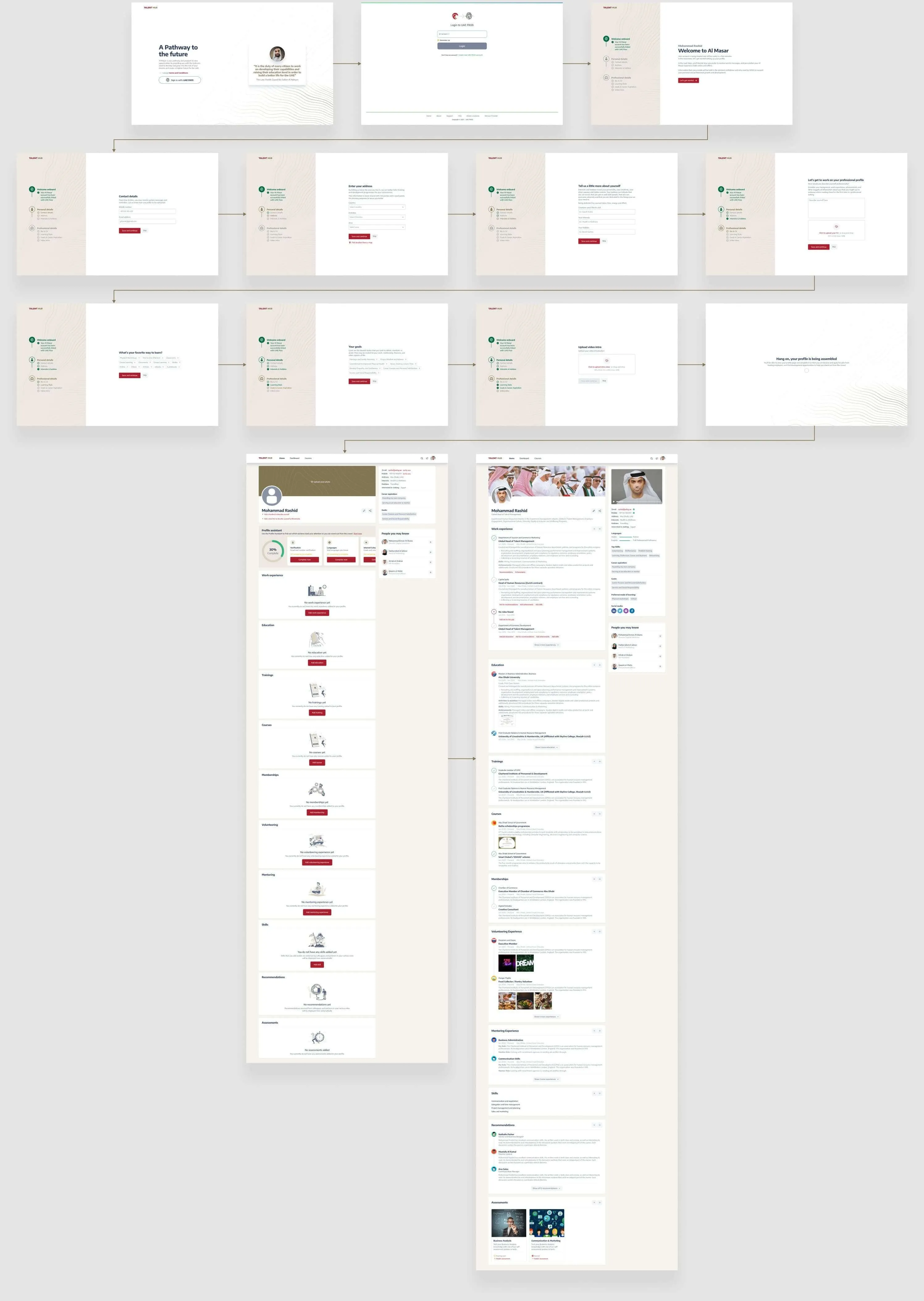
The individual experience started with building a talent profile. We needed enough information to understand each person beyond their job title, without turning onboarding into a long form.

Where reliable information already existed in government systems, such as Emirates ID and labour records, we brought it into the profile automatically. Users could then focus on adding the things those systems did not know: their interests, learning preferences, career goals and a short video introduction.

This reduced unnecessary input while giving Talent Hub a much richer picture of each person and what they wanted to do next.

Making profile data clear

Making it clear what users could change

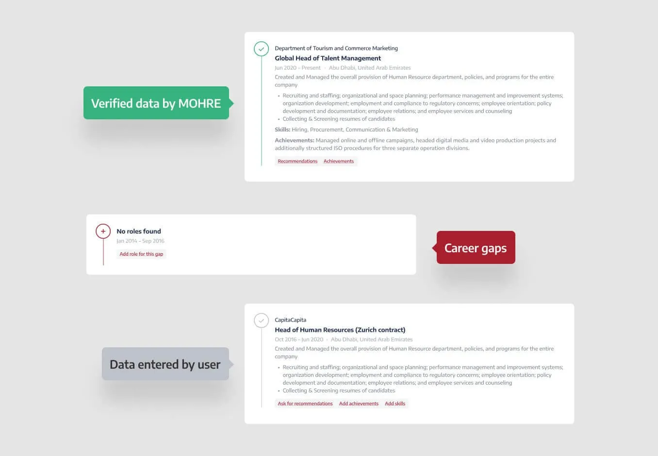
Bringing data from government systems saved time, but it introduced another problem: not everything in the profile worked the same way.

Some information was already verified and could not be edited. Some was missing and needed the user's attention. Other details could be updated whenever their situation changed.

We created a simple visual system to make those differences clear: green for verified information, red for gaps that needed attention, and a neutral treatment for editable information.

Users could understand the state of their profile at a glance, without having to work out where each piece of information came from.

Profile completion

Not everything needed to happen at once

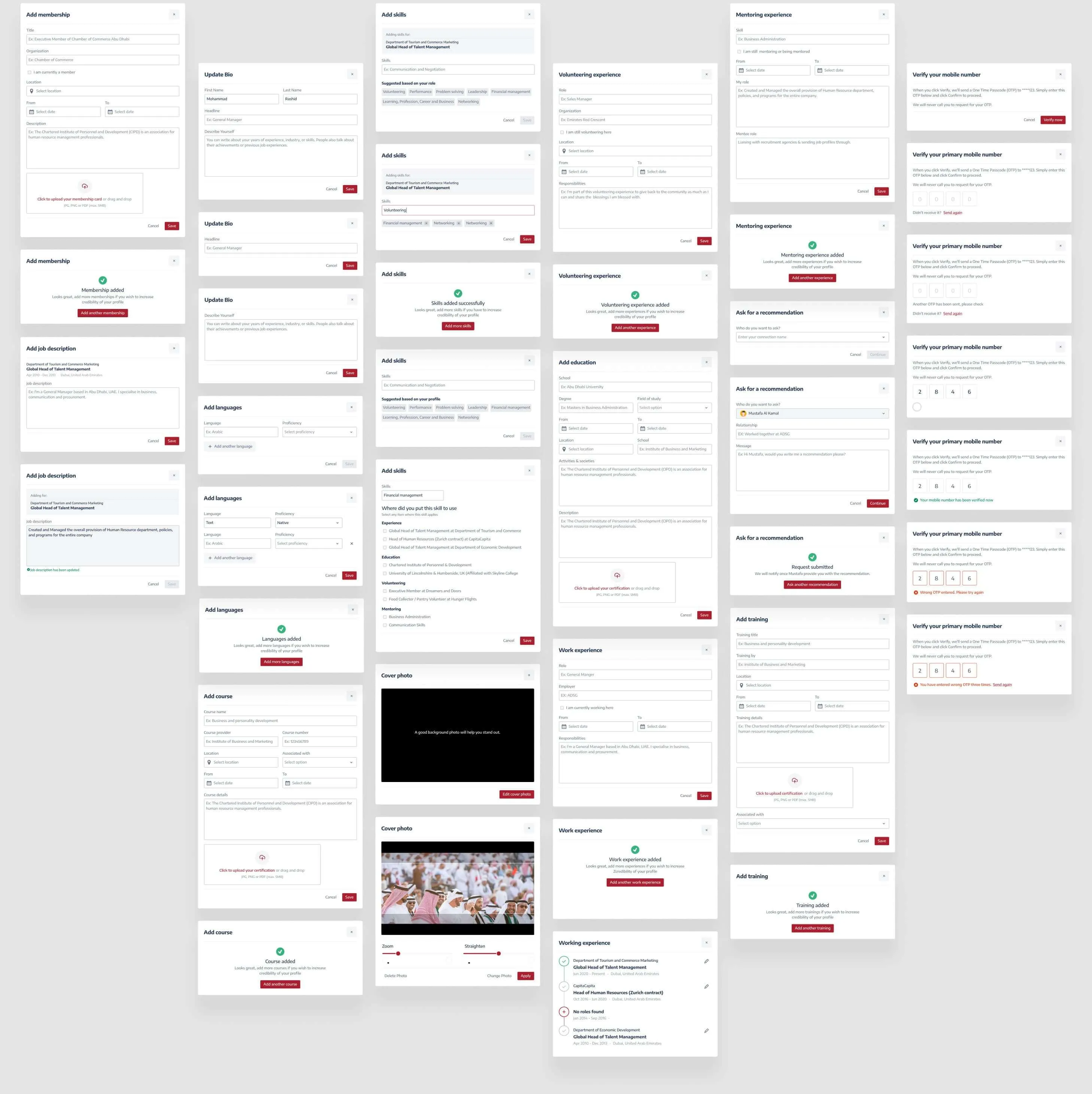
A complete talent profile contained a lot of information, but asking users to deal with all of it in one long flow would have made the experience unnecessarily heavy.

Instead, we used focused prompts to bring people into specific parts of their profile when something needed their attention.

Each interaction had a clear purpose and a smaller task to complete. This made it easier for users to build and improve their profile over time, rather than treating onboarding as something they had to finish in one sitting.

Dashboard

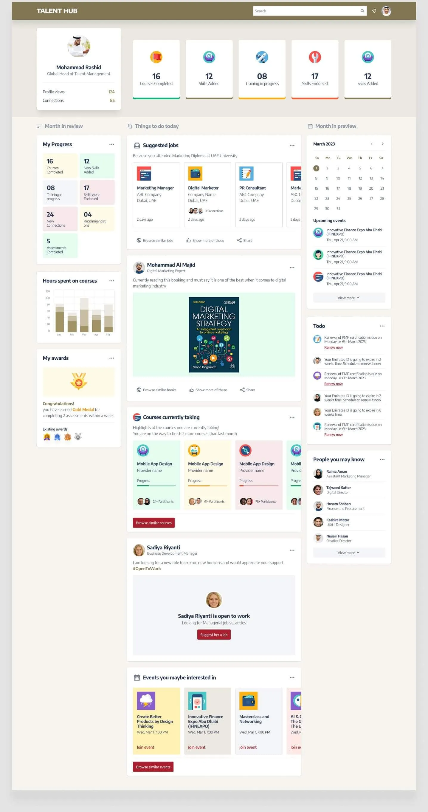
Turning the profile into something useful

Once the profile was set up, the experience needed to move beyond collecting information and give people a reason to keep coming back.

We structured the homepage around three simple timeframes: a recap of recent progress, what needed attention today, and what was coming up next.

Instead of presenting users with another dashboard full of data, the aim was to answer a more useful question each time they logged in: where am I now, and what should I do next?

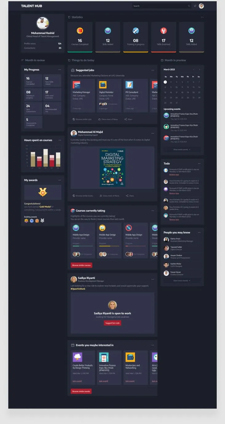
The same experience was designed in light and dark modes, keeping the hierarchy and interactions consistent across both.

Design System

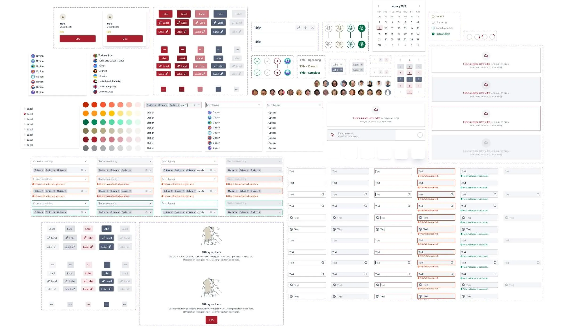
Keeping the product consistent across the team

Talent Hub was being designed and built by people working across different locations, so consistency could not depend on everyone remembering how each screen should look or behave.

I created a shared design system that gave the team a common set of components and patterns to work from.

This gave designers and developers reusable building blocks as the product grew, instead of solving the same interface problems repeatedly.

Executive experience

The same data, viewed at a very different scale

For individuals, Talent Hub was about understanding their own progress and opportunities. For senior leaders, that same talent data needed to answer much bigger questions.

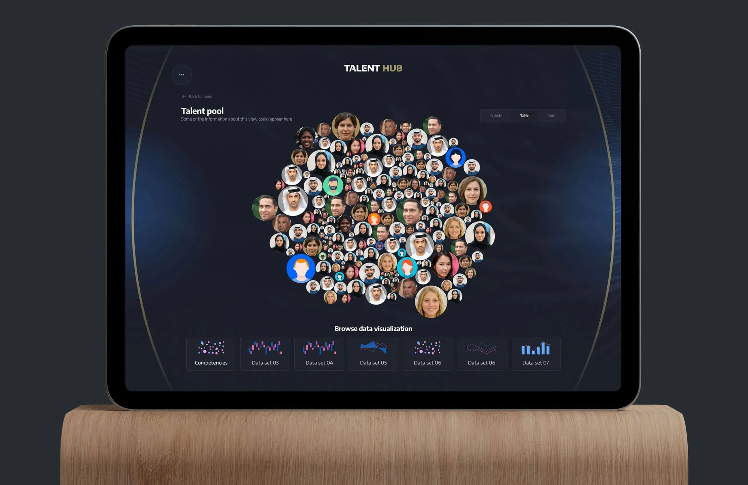
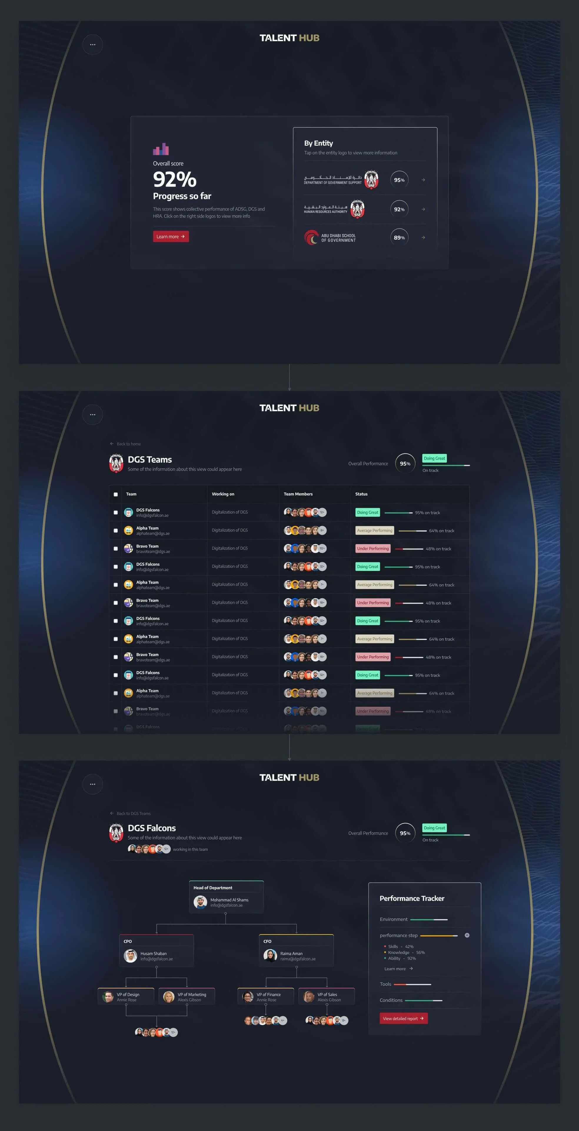
The executive experience gave the Director General a view across the wider talent pool, making it possible to explore people, skills and performance across teams and ministries.

The challenge was not simply showing more data. It was deciding how to organise it so a large amount of information could support real decisions without becoming another dense government dashboard.

Visualising talent pool data

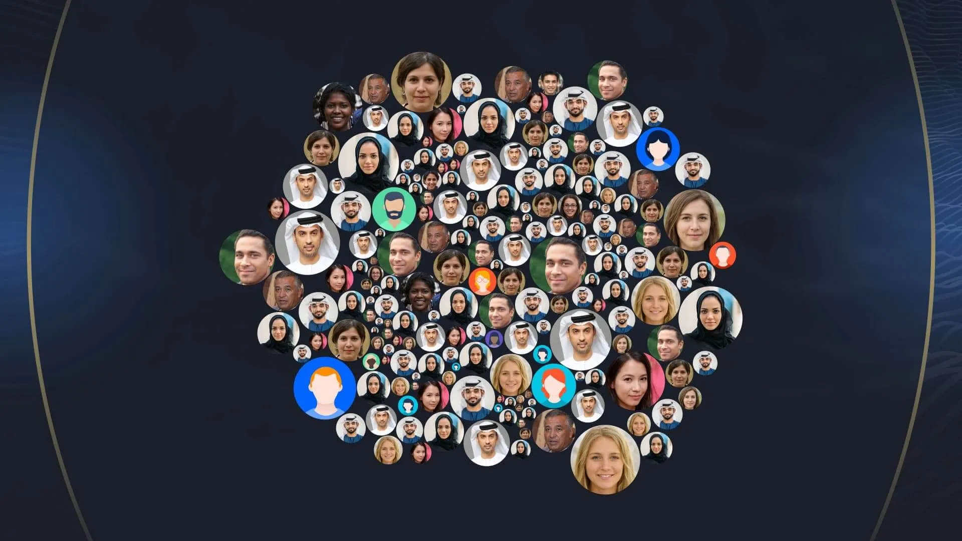
Finding the right people in a large talent pool

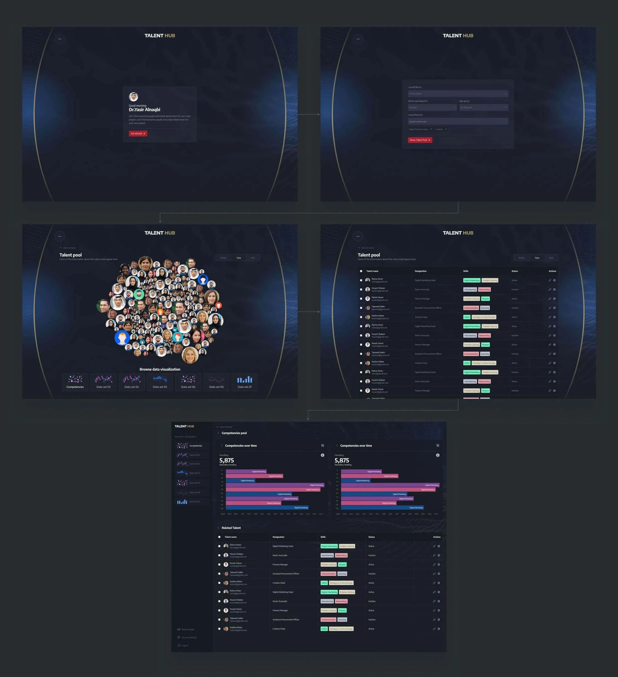
One of the scenarios we explored was helping the Director General understand who was available across the organisation and identify people for specific needs.

For example, a leader might need to find IT professionals within a certain age group for a digitalisation project. Instead of searching through individual profiles, Talent Hub brought the wider talent pool together and made it possible to explore it through relevant data and visualisations.

The interface was designed to progressively narrow a large amount of workforce data into a useful group of people, while still giving leaders enough context to understand who they were selecting.

What I took away

Designing for the person and the bigger picture

Talent Hub was a good reminder that the same data can mean very different things depending on who is using it.

For an individual, it was about their profile, progress and what they could do next. For a senior leader, it was about seeing patterns across hundreds of people and using that information to make better workforce decisions.

My role was to connect those two perspectives into one product, keeping the experience simple at the individual level while making the underlying information useful at a much larger scale.

That balance shaped many of the decisions throughout the project.

Farhan's experience in developing rational designs shows in his work.

He lets his work do the talking, and can be trusted to meet deadlines. He works well independently and with others, and I have thoroughly enjoyed working with him on a number of projects.

Kenneth Wong
Kenneth Wong Design Strategy Lead at Orbit Communications