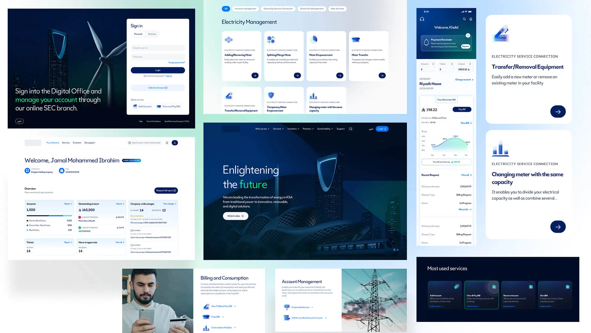
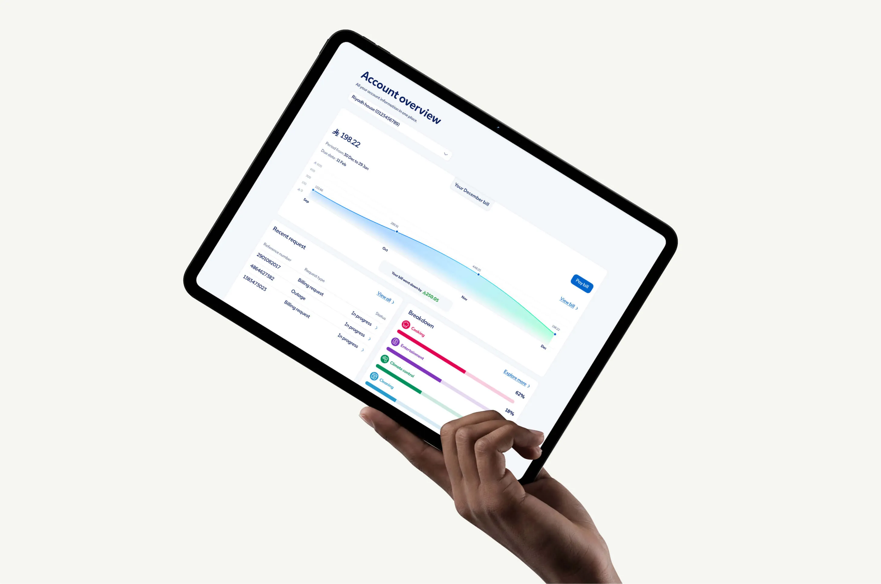
Creating one consistent digital experience for Saudi Energy’s new identity.

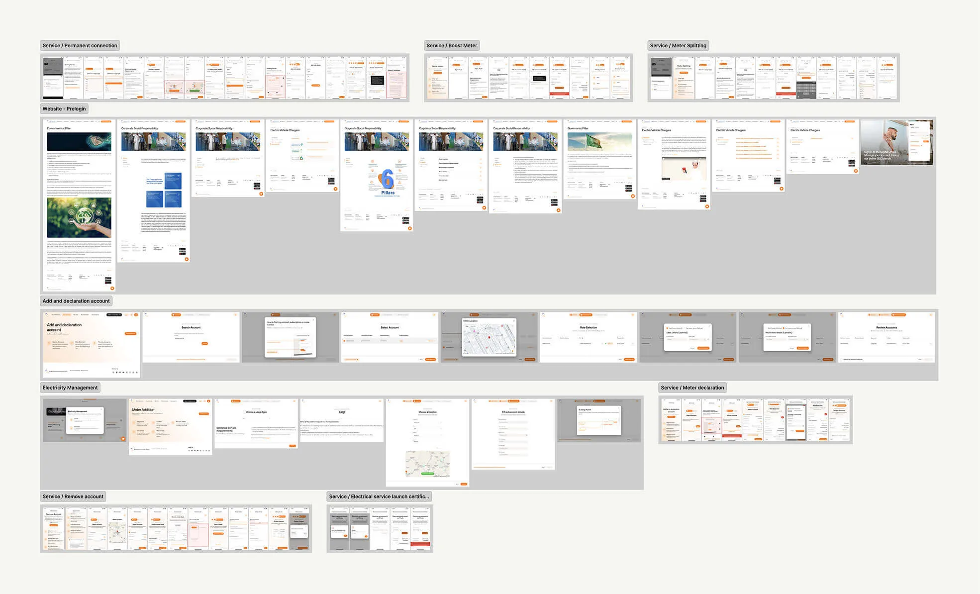
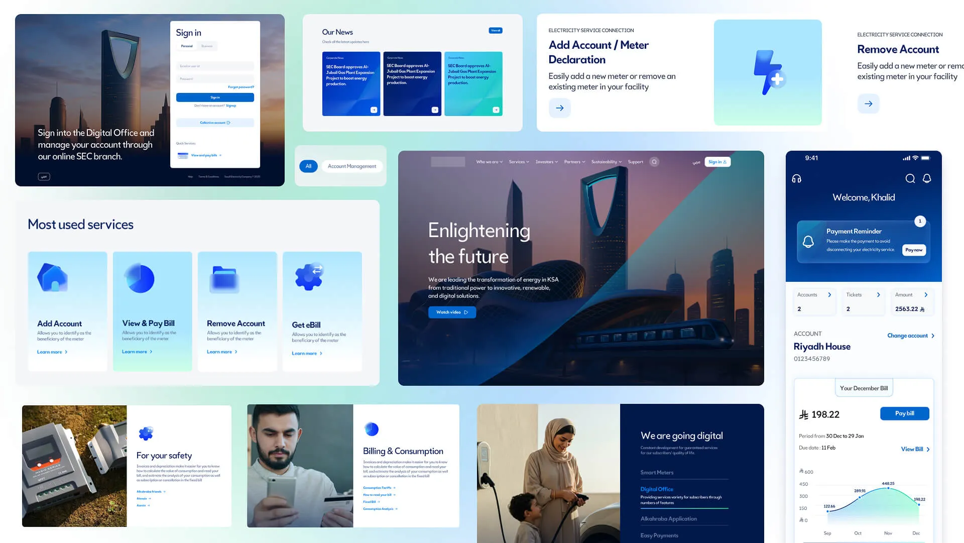
Saudi Energy was preparing a major rebrand across a large digital ecosystem, with thousands of existing screens that needed to move to the new identity without disrupting ongoing product work.

I led the design system work and early UI exploration, working with 10–12 designers, developers and stakeholders through Horizontal Digital to bring the new brand across web and app products.

My role

UI & Design System Lead

Project for

Saudi Energy

Worked with

Horizontal Digital

About the project

This was not simply a new look. It had to work across thousands of existing screens

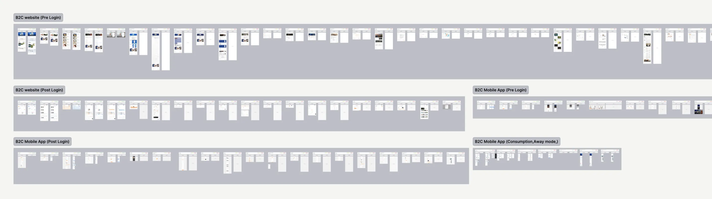
Saudi Energy already had a large digital ecosystem across web and mobile, with thousands of existing screens and journeys. Around 10–12 designers were actively working across these products, so the work could not simply stop while we prepared for the new identity.

The new brand kit was being developed by the client and had to remain confidential until close to launch. Until we received it, we did not have the final colours, typography and other brand elements to work with.

That meant we had to prepare as much as possible without seeing the final brand, so that once it arrived, we could move a large existing product ecosystem to the new identity within a fairly short window.

The challenge

Before the final brand arrived, I focused on getting the system ready for it

Once the final brand arrived, updating thousands of screens individually was never going to be practical. I needed to prepare the system behind them so the change could start from one place and travel through the products.

Before I could do that, I needed to understand what was already there. That is when I discovered we were dealing with three different design systems.

My first challenge was making sense of three different design systems and turning them into one structure the team could confidently build on.

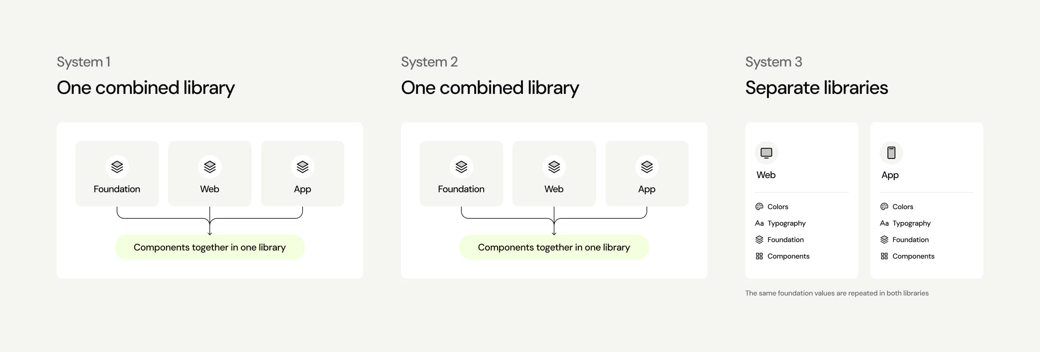
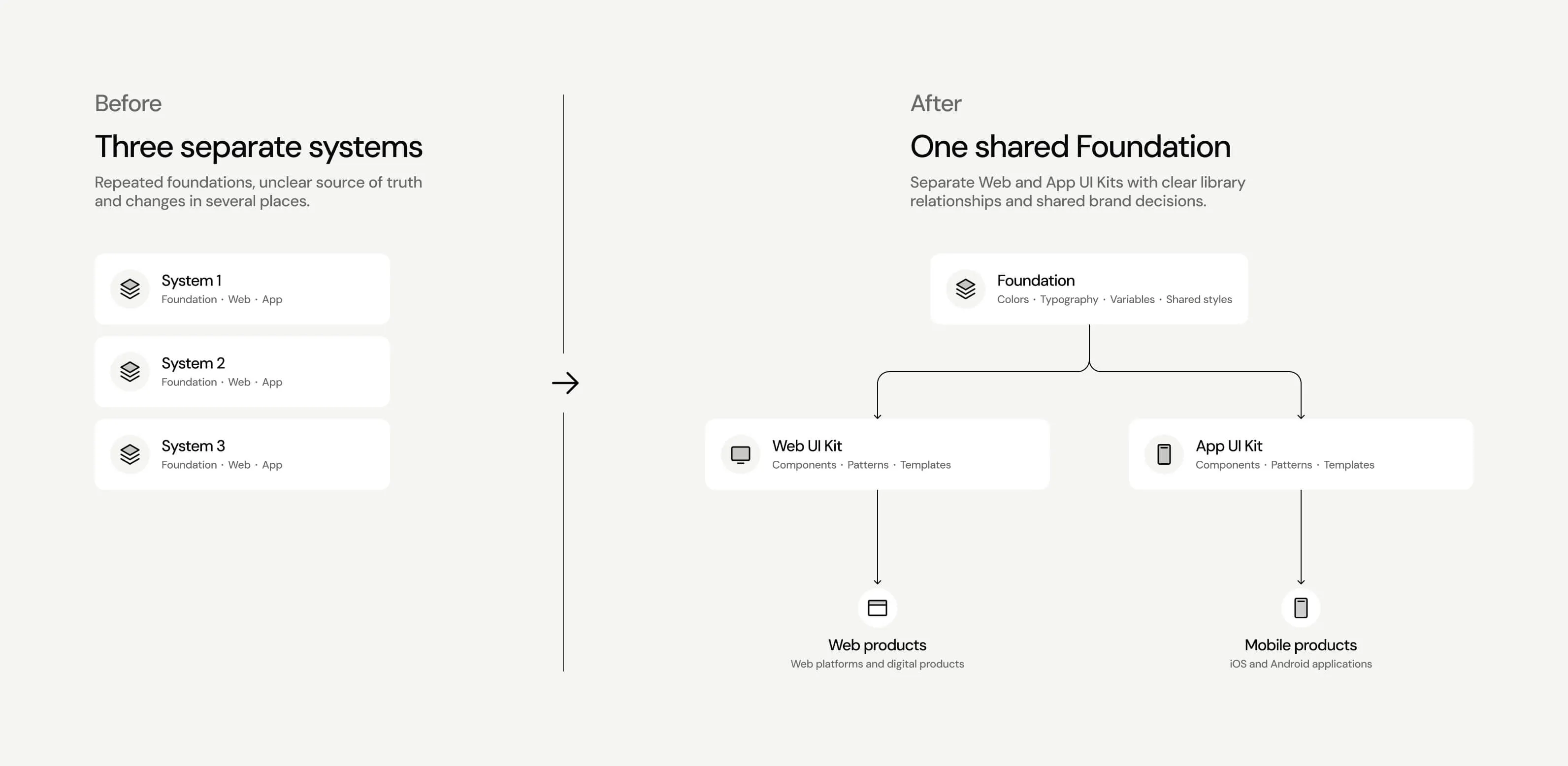
When I looked at the existing setup, I found three different versions of the design system. Two were older libraries where foundations, web and mobile components all lived together. Over time, they had become difficult to navigate, and designers were not always sure which component or version they should use.

The newer version was better organised, with separate libraries for web and mobile. But each library still had its own colours, typography and other shared foundations.

For a rebrand, this was a problem. A change to something as basic as a colour or type style could mean updating it in several places. Before preparing for the new brand, I needed to simplify this structure first.

The solution

The solution was one shared foundation, with separate UI kits for web and mobile

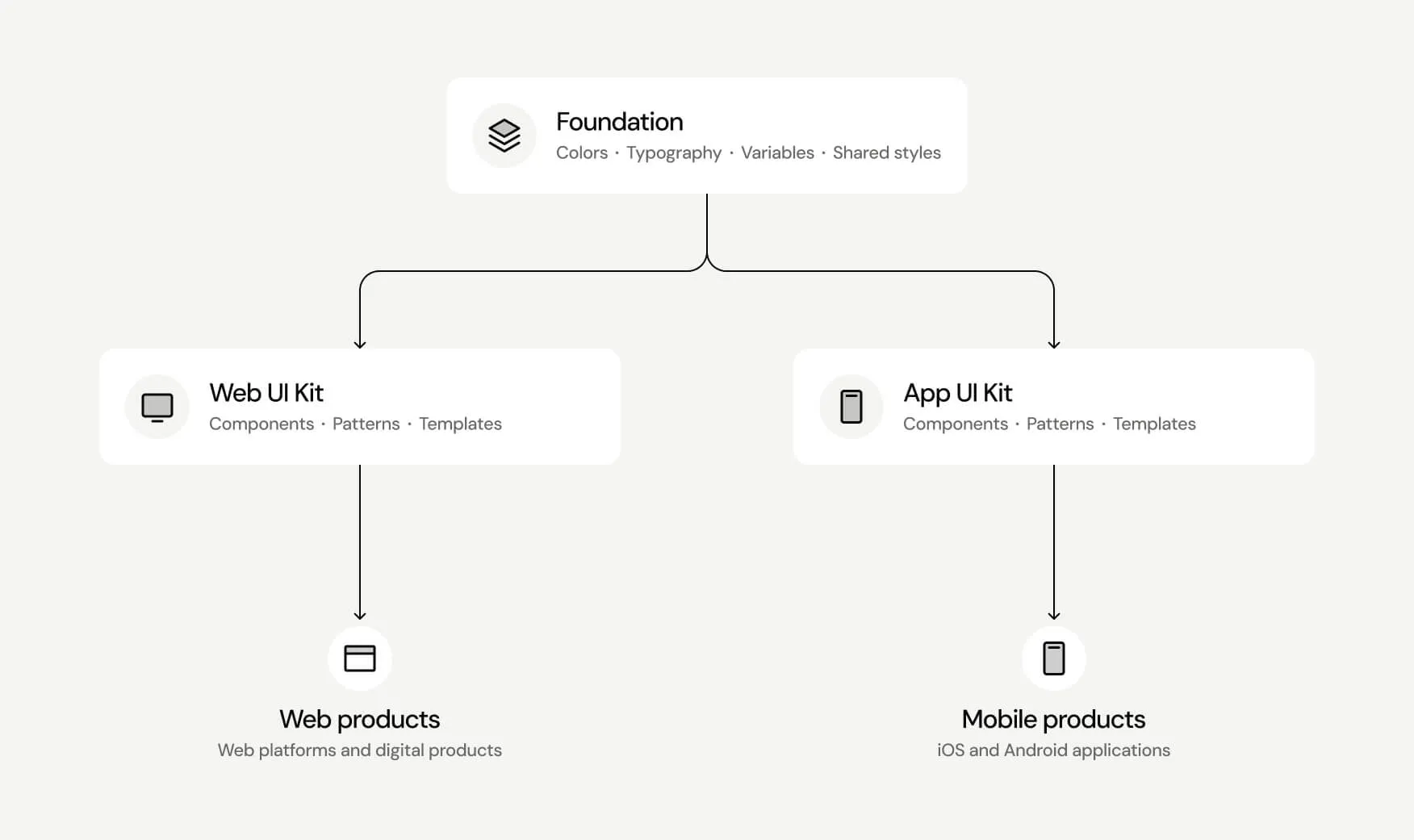
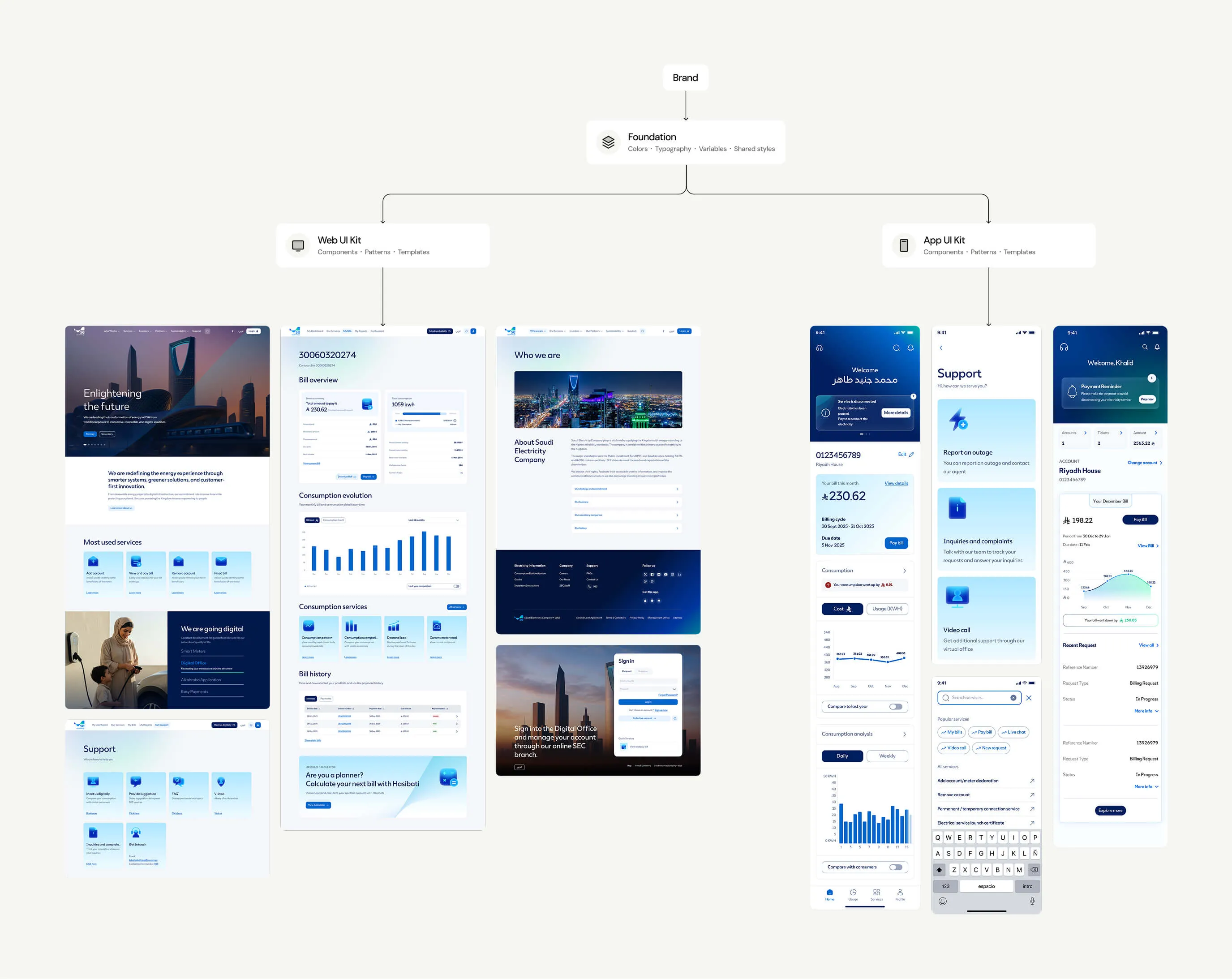
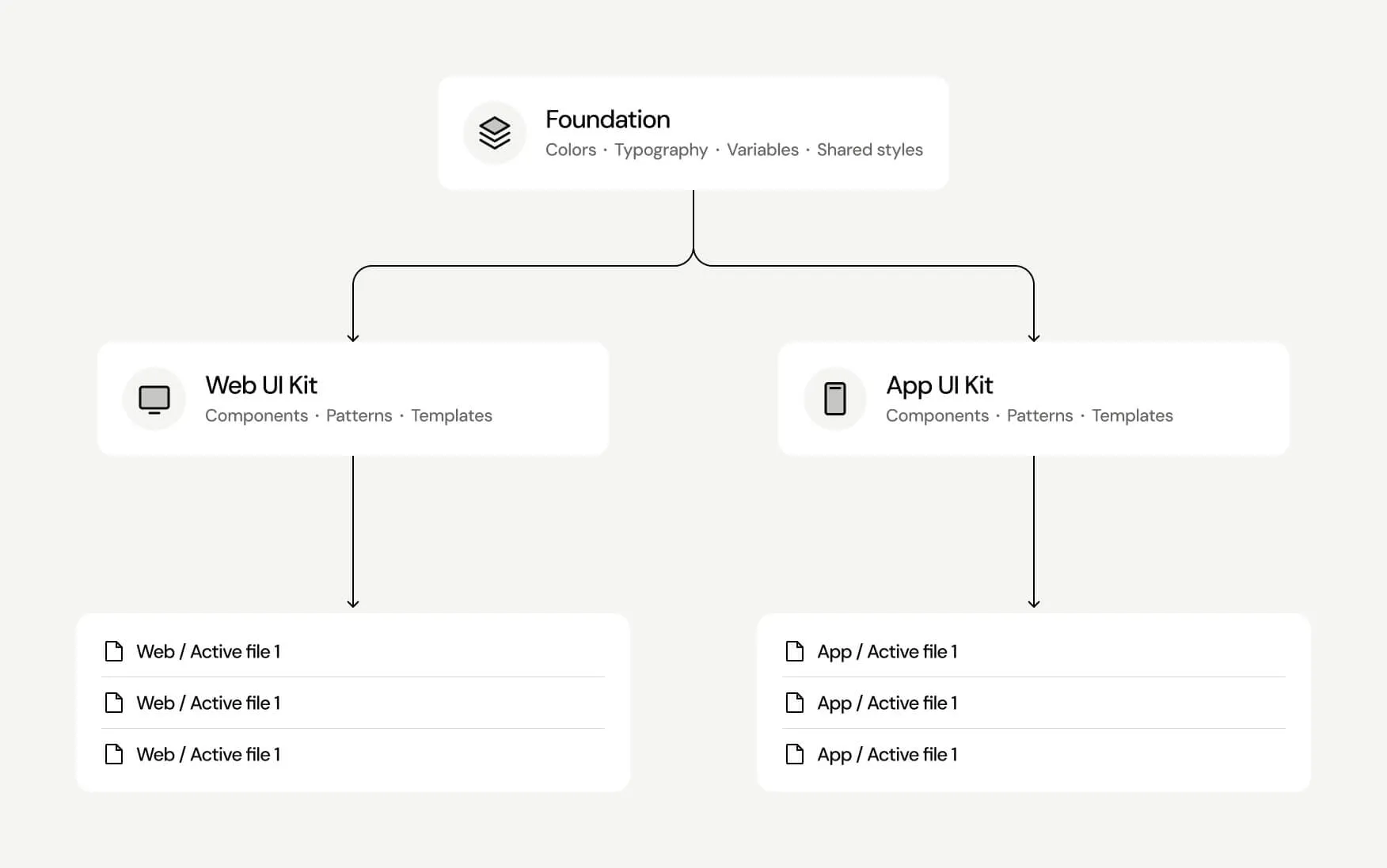
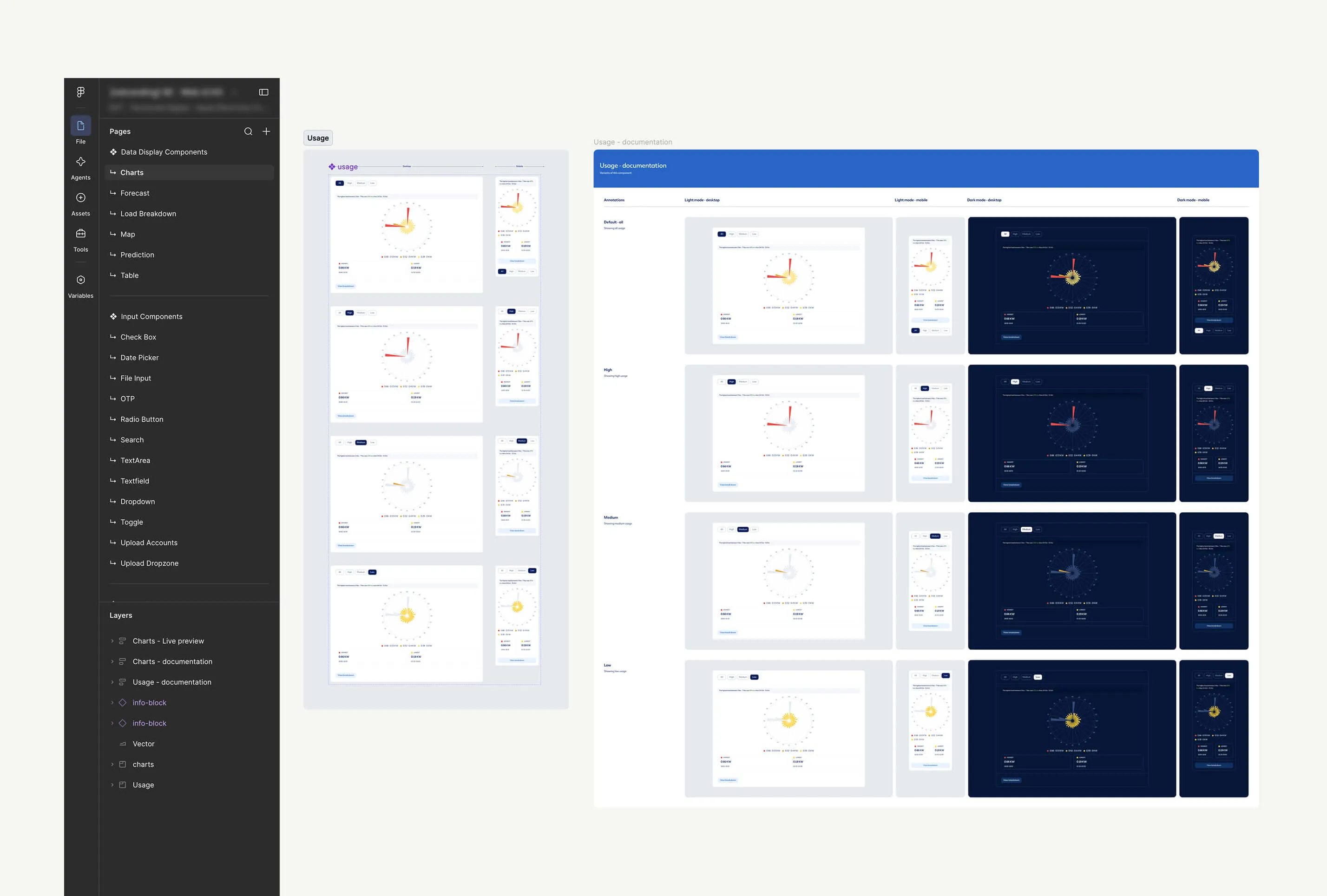
I proposed a simpler structure: one Foundation library for everything shared across web and mobile, including colours, typography and variables. Web and mobile would then have their own UI Kits for the components and patterns specific to each platform.

This gave us one place to manage the new brand. Instead of making the same change across different libraries, we could update the Foundation once and let those changes flow through the Web and App UI Kits into the products using them.

Preparing before the reveal

I used temporary values to test everything we could before the reveal

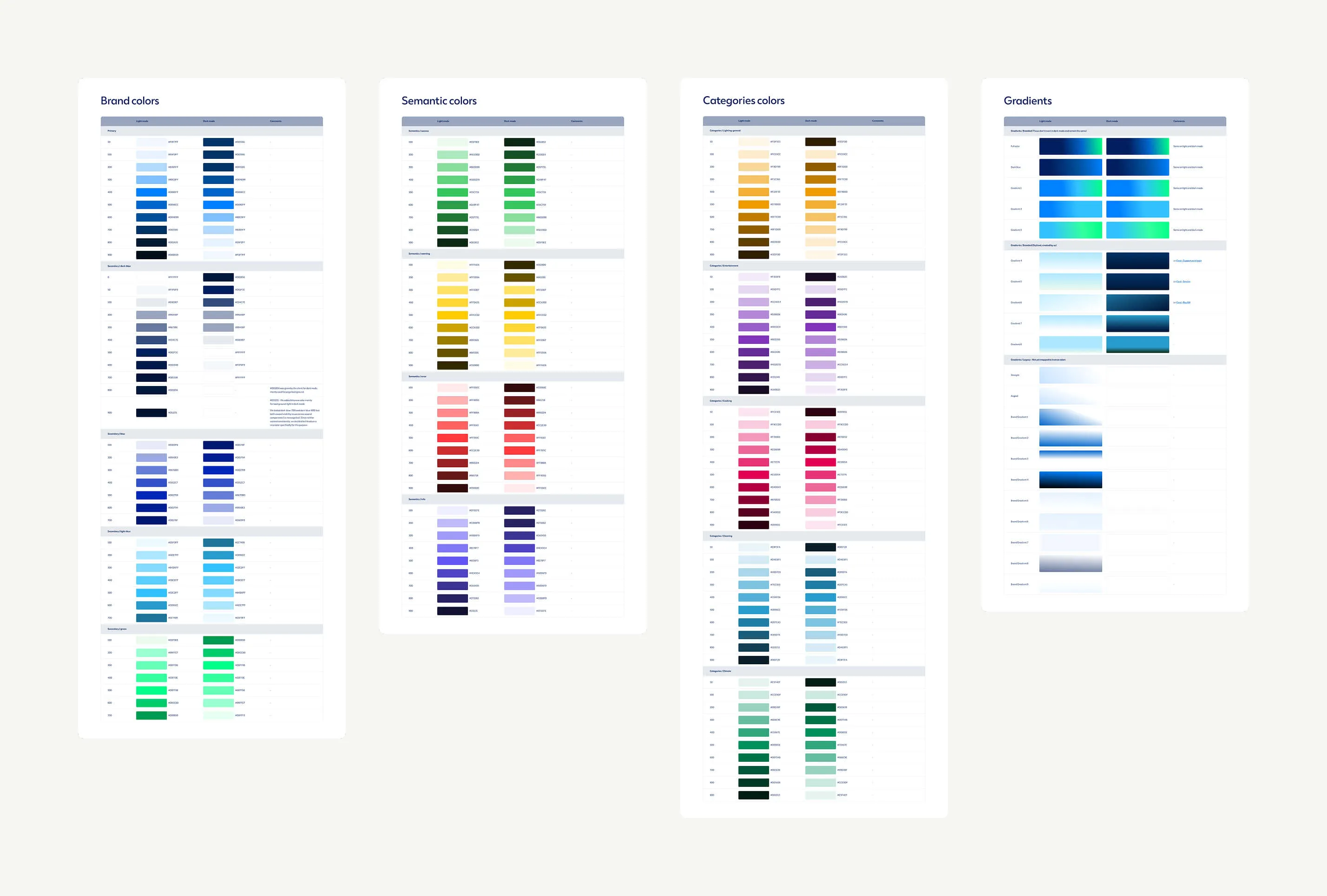
The new brand was still confidential, so I used temporary values to test the system before the final colours and typography arrived.

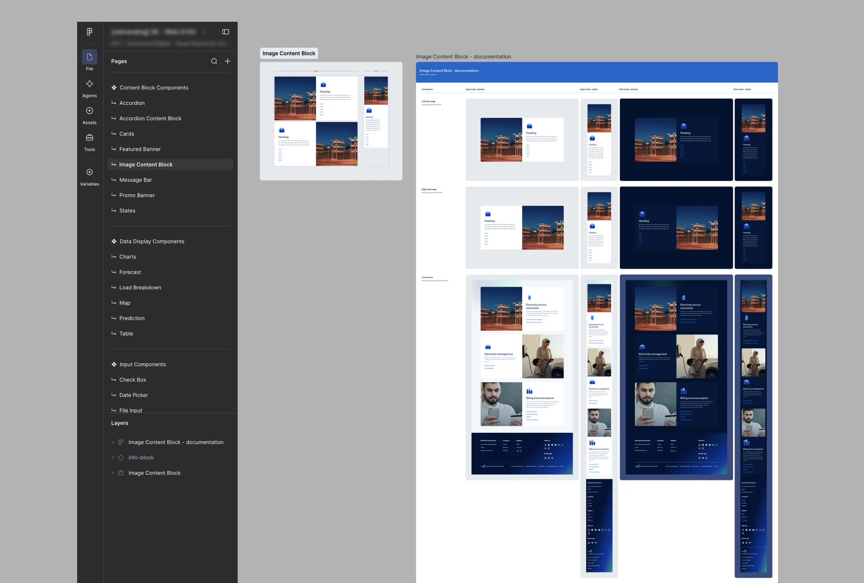
I created 1:1 templates showing the existing screen beside the same screen connected to the new system. This let us see changes immediately and helped uncover hardcoded values, disconnected components and local overrides early.

Preparing for the new typography

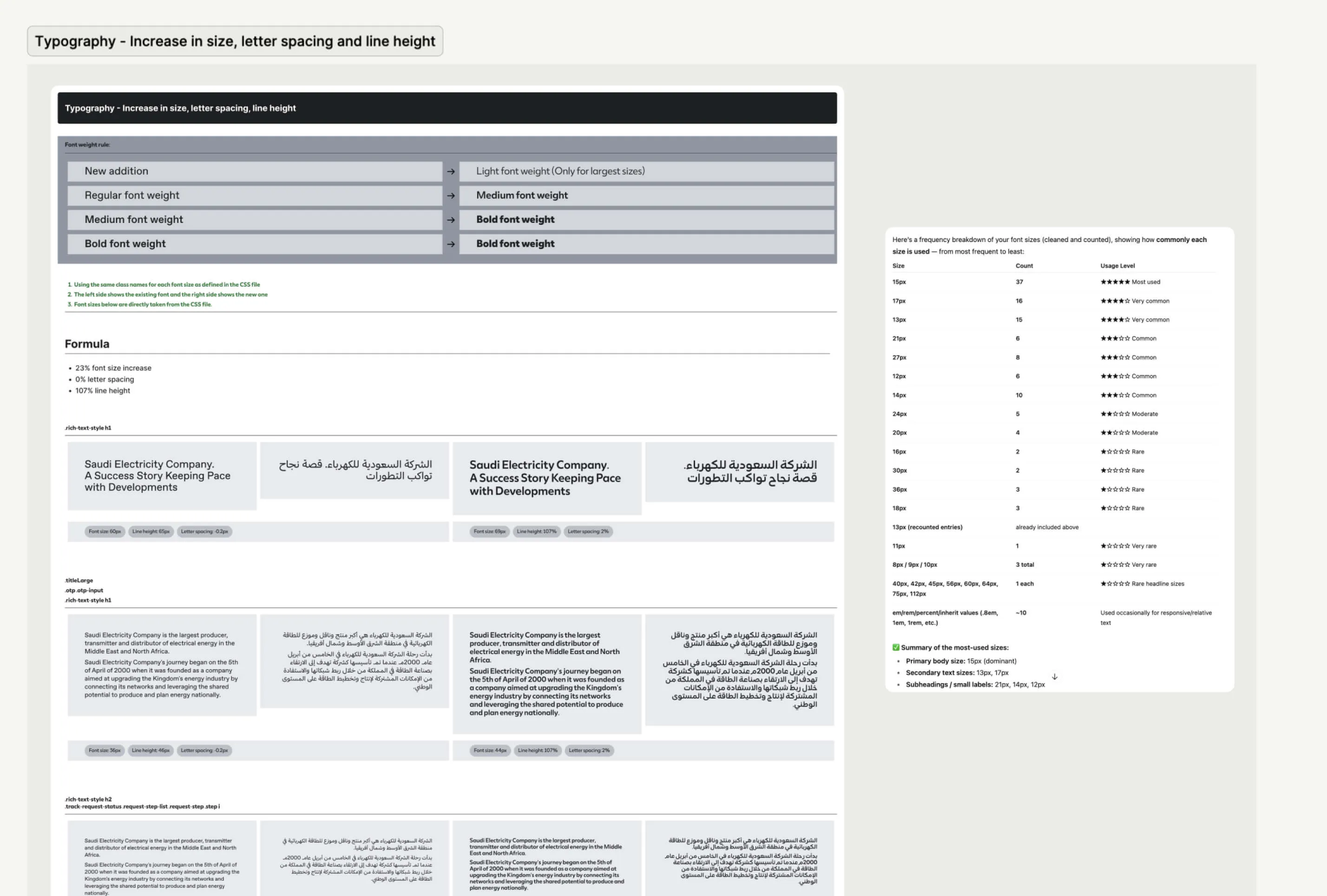
A new font could change text widths, wrapping and layouts across thousands of screens. We compared the old and new fonts across different sizes, then worked out a sizing formula for the new font that kept layouts as close as possible to the existing product.

Connecting design with existing code

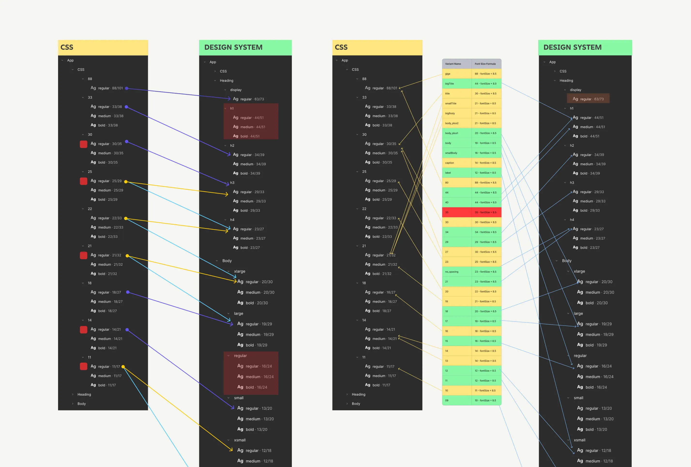
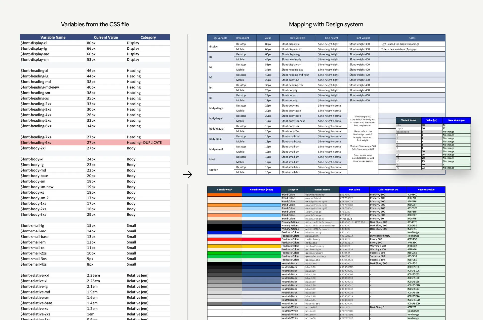
We also needed to work with the typography already in production. We used AI to help identify the existing font sizes, compared them with the new design system, and created mapping tables between design and development.

When the real brand arrived

When the final brand arrived, we were ready to move quickly

Once we received the final brand kit, I could replace the temporary values with the real colours, typography and other brand elements we had been preparing for.

Because the Foundation, Web UI Kit and App UI Kit were already connected, many of those changes could start from one place and move through the system into the products. I could then focus on the components and screens that needed individual attention.

There was still plenty to review and refine, but we were no longer looking at thousands of screens and wondering where to start. The preparation had given us a much more controlled way to roll out the new brand.

Development handoff

We also needed a practical way to get the new design into production

There was not enough time to redesign every screen and then hand everything over to development. Much of the existing product was already built, so we needed a way to update it without rebuilding everything from scratch.

We took a design-led approach. Once the new colours, typography and other shared values were defined in the design system, we worked with development to map those changes to the existing CSS.

We created side-by-side mapping tables showing the existing values and what they should become in the new system. This gave developers a clear reference for updating the existing product while keeping the design and code aligned.

Managing a live system

The system had to change without getting in the way of 10–12 designers using it

The work did not stop while I was making these changes. Around 10–12 designers were using the libraries every day, working across different parts of the web and mobile products.

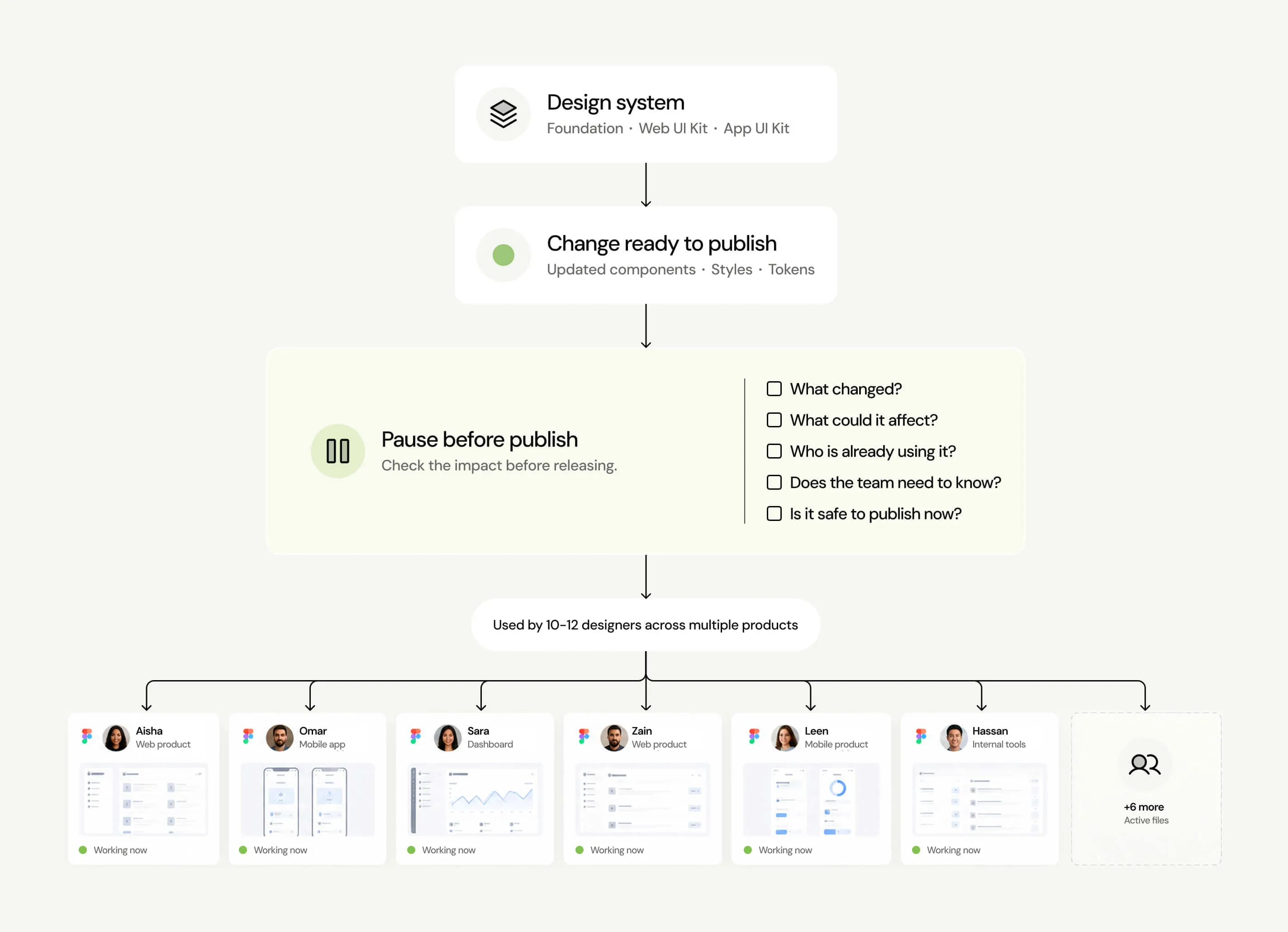
That meant even a small change could affect screens and files outside the work I was looking at. Something could be correct in the design system but still cause problems for a designer already using that component somewhere else.

So I became much more careful about what I published and when. Before releasing a change, I checked what it could affect, who was using it and whether the team needed to know about it first. Sometimes the safest decision was simply to wait.

Design system governance

Rebuilding the system was only part of the job. Keeping it reliable was the next challenge

As more designers started working with the new system, existing problems became easier to spot. There were duplicate components, wrong colours and type styles, local changes and components that were no longer properly connected to the libraries.

Fixing each problem as it appeared would not be enough. We needed clearer rules around what should go into the system, when an exception was acceptable and how changes should be reviewed before everyone received them.

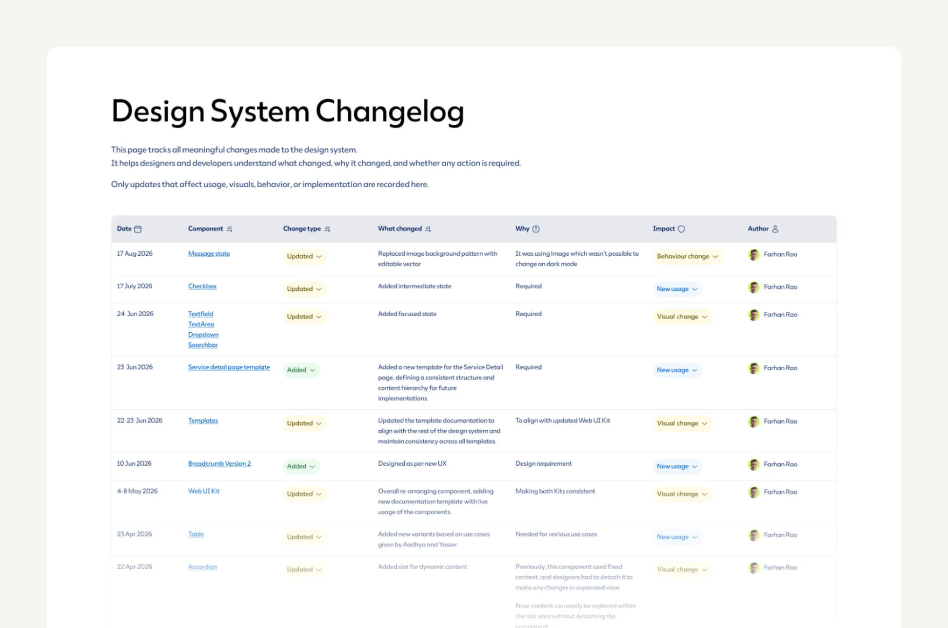
We introduced regular reviews, audits and change tracking, with clearer ownership and a simple way to judge the impact of changes before they were published.

The next test

The rebrand was finished, but the system still needed to handle what came next

After the rebrand, we started working on dark mode across the same web and mobile products. It was a different challenge, but it needed to work through the same system we had just rebuilt.

We first tried mapping every existing colour to a dark equivalent. Once we tested this across real screens, we found it was too rigid. The same colour could be used for text in one place, a background somewhere else and for a completely different purpose in another component.

I moved the system to semantic tokens instead. Rather than defining colours only by their value, we defined them by their purpose, such as text, background or status. Each could then have the right value for light and dark mode while the components continued using the same shared system.

Dark mode showed that the new foundation could adapt to another major change without creating another system to manage.

The outcome

We ended with more than a successful rebrand

What started as preparing for a new identity became a much deeper change to the system behind Saudi Energy's digital products.

We went from three competing design systems to one shared Foundation with dedicated Web and App UI Kits. The new brand could be managed from a clearer source of truth, while designers continued working across the products throughout the transition.

More importantly, the system did not stop at the rebrand. It continued to support new work, stronger governance and eventually light and dark themes without having to rethink the foundation every time something changed.

I had the pleasure of working with Farhan as part of the same design team, and I was consistently impressed by his strong UI design skills and deep expertise in design systems.

Farhan brings a great balance of visual craft, attention to detail, and systems thinking to his work. He has a strong understanding of how to create scalable, consistent, and maintainable design solutions rather than designing individual screens in isolation. His ability to work with components, patterns, and design system principles makes him a valuable asset to any product design team.

Beyond his design expertise, Farhan is a great team player and collaborator. He is open to feedback, thoughtful in his approach, and committed to maintaining a high standard of design quality. I would highly recommend Farhan to any team looking for a senior UI designer with strong design system expertise and a collaborative mindset.
Zeeshan Khalid
Zeeshan Khalid DesignOps Lead at Horizontal Digital