Redesigning the digital experience behind dnata’s services across five continents.
dnata needed to rethink its global website to make its services and operations across five continents easier for customers to explore and understand.
I led the UI design with Valtech, working closely with the UX designer and development team to shape the responsive experience and build a flexible UI system that could support the site as it grew.
My role
UI & Design System
Project for
dnata
Worked with
Valtech
About the project
Redesigning more than a collection of pages
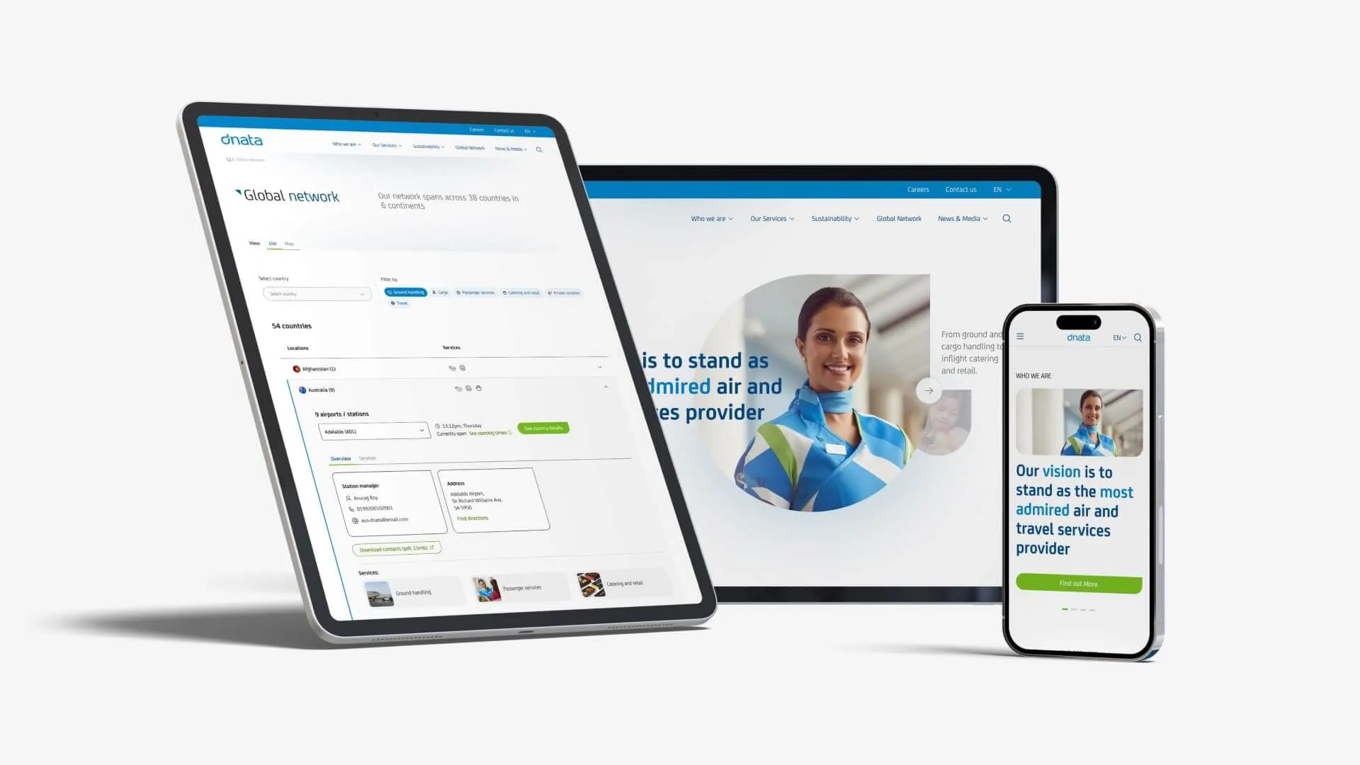
Working with Valtech, I helped redesign dnata.com to make its services, locations and content easier to navigate and understand.
The work covered the core website experience, responsive page templates and a reusable UI kit. The aim was to create something that worked well for the immediate redesign, but also gave the team a consistent foundation for building and updating pages as the website evolved.
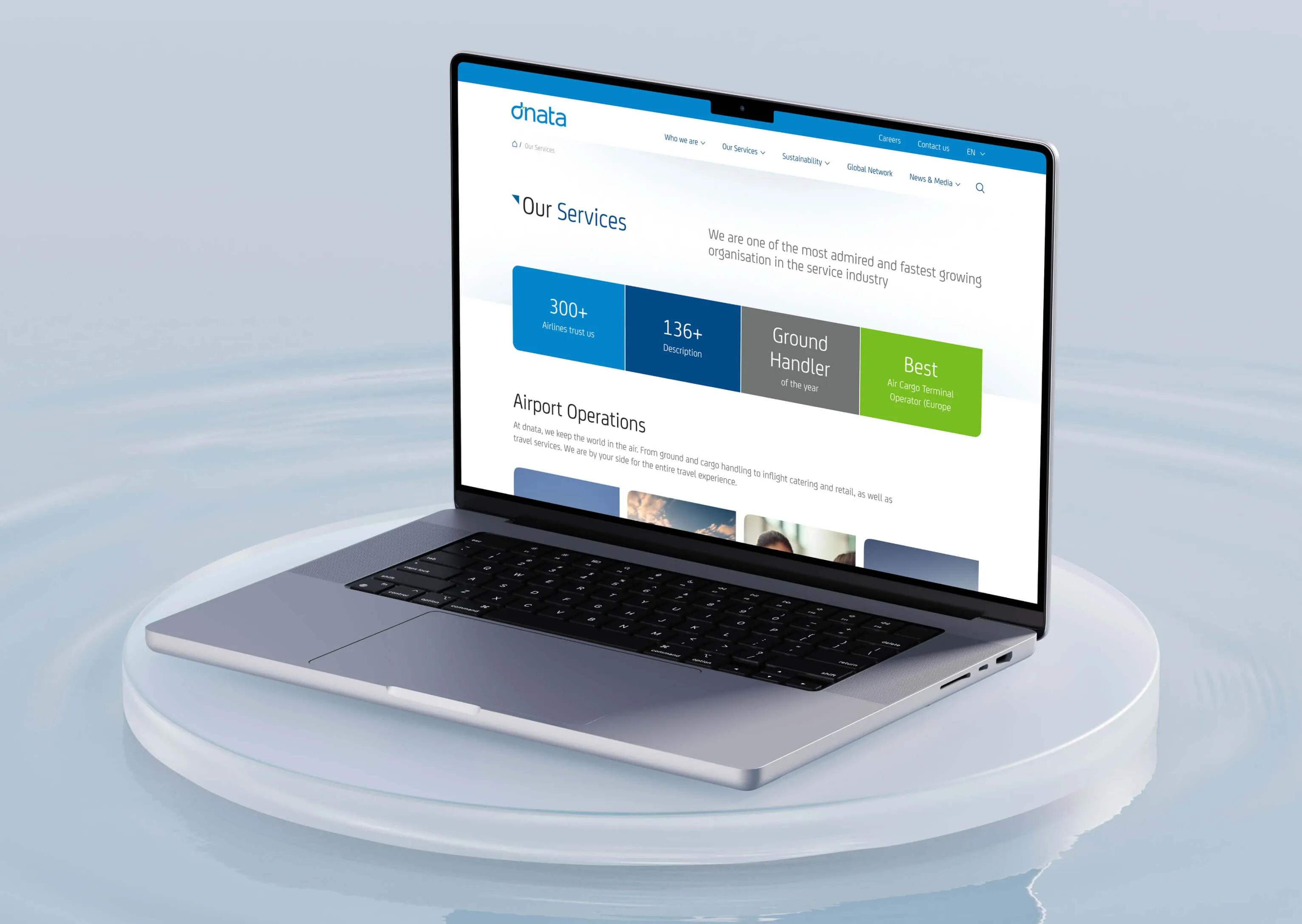
The challenge
Making dnata’s information easier to find across a complex global business
Over time, the website had become harder to navigate. Important information such as services, locations and contact details was spread across a structure that made simple tasks take more effort than they should.
The challenge was to make that information easier to find while still supporting the scale and variety of dnata’s global business.
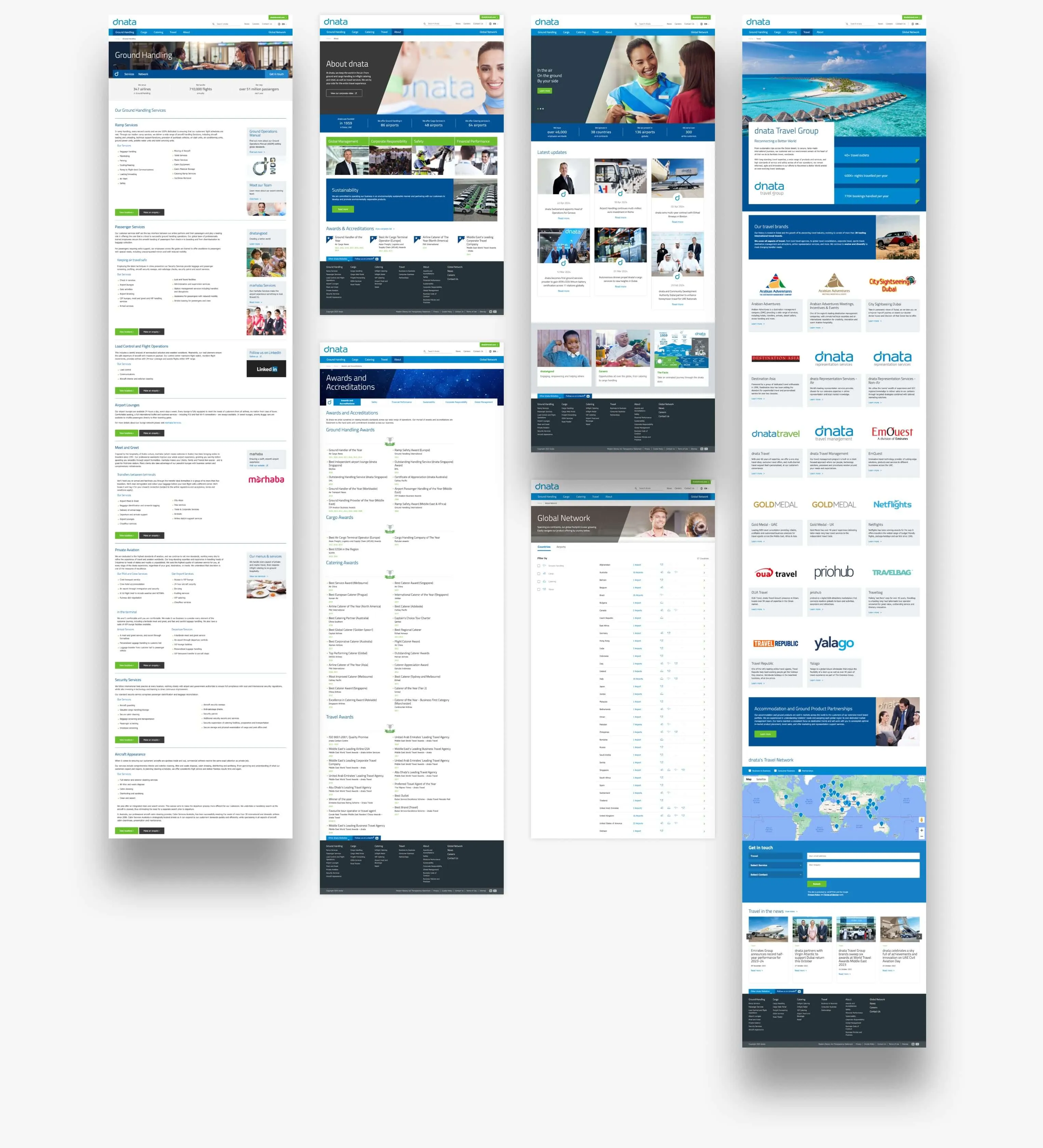
Design direction
Using hierarchy and structure to make the experience easier to scan
The visual direction grew directly from the navigation problem. I simplified page structures, created clearer hierarchy between content, and used more space to help people understand what was important and where to go next.
At the same time, the design needed to stay recognisably dnata and work across many different types of pages. Rather than changing the brand for the sake of a new look, the focus was on making it work better as a digital experience.
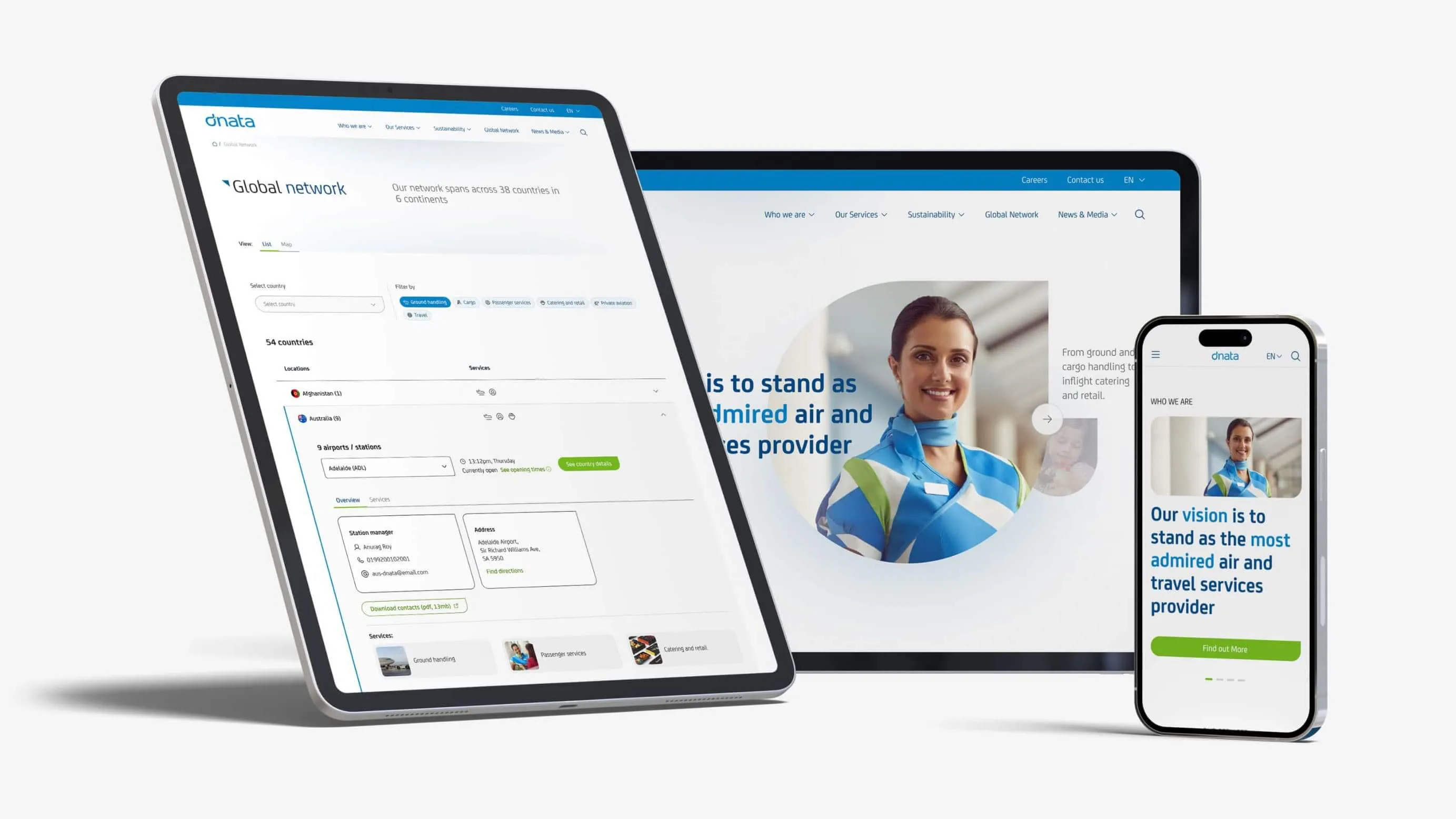
Mobile first
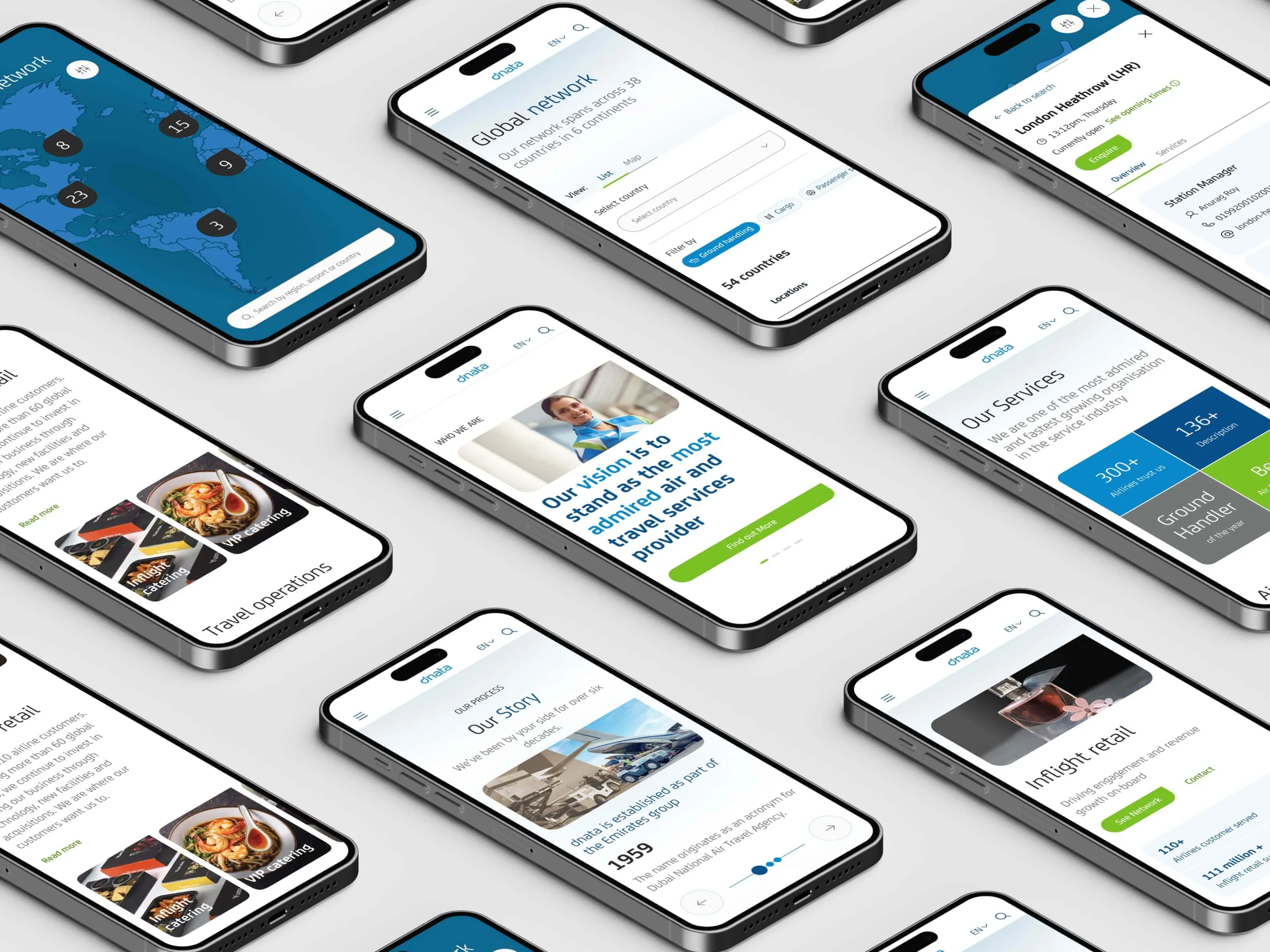
Making the same complexity work on a much smaller screen
Designing mobile-first forced me to prioritise what people needed most and simplify how they reached it. Navigation, content hierarchy and interactions had much less space to work with, without simply becoming smaller versions of the desktop experience.
This was especially important for more complex parts of the site, including the global network, where the interaction needed to remain clear and useful across both desktop and mobile.
Global network
Turning dnata’s global presence into a useful way to find information
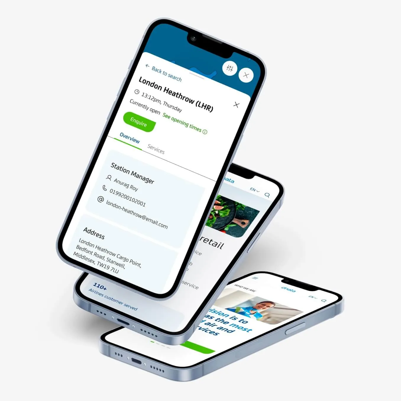
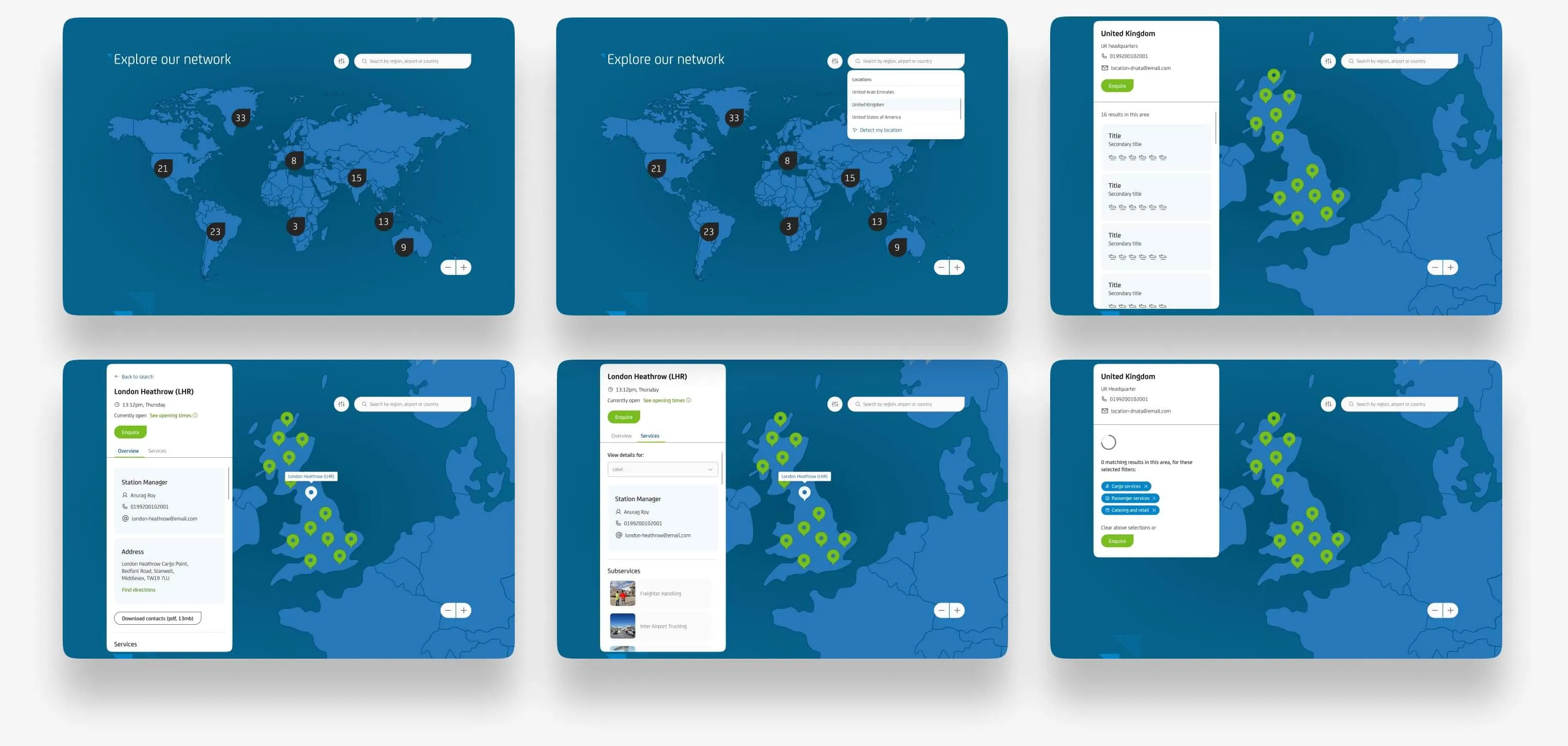
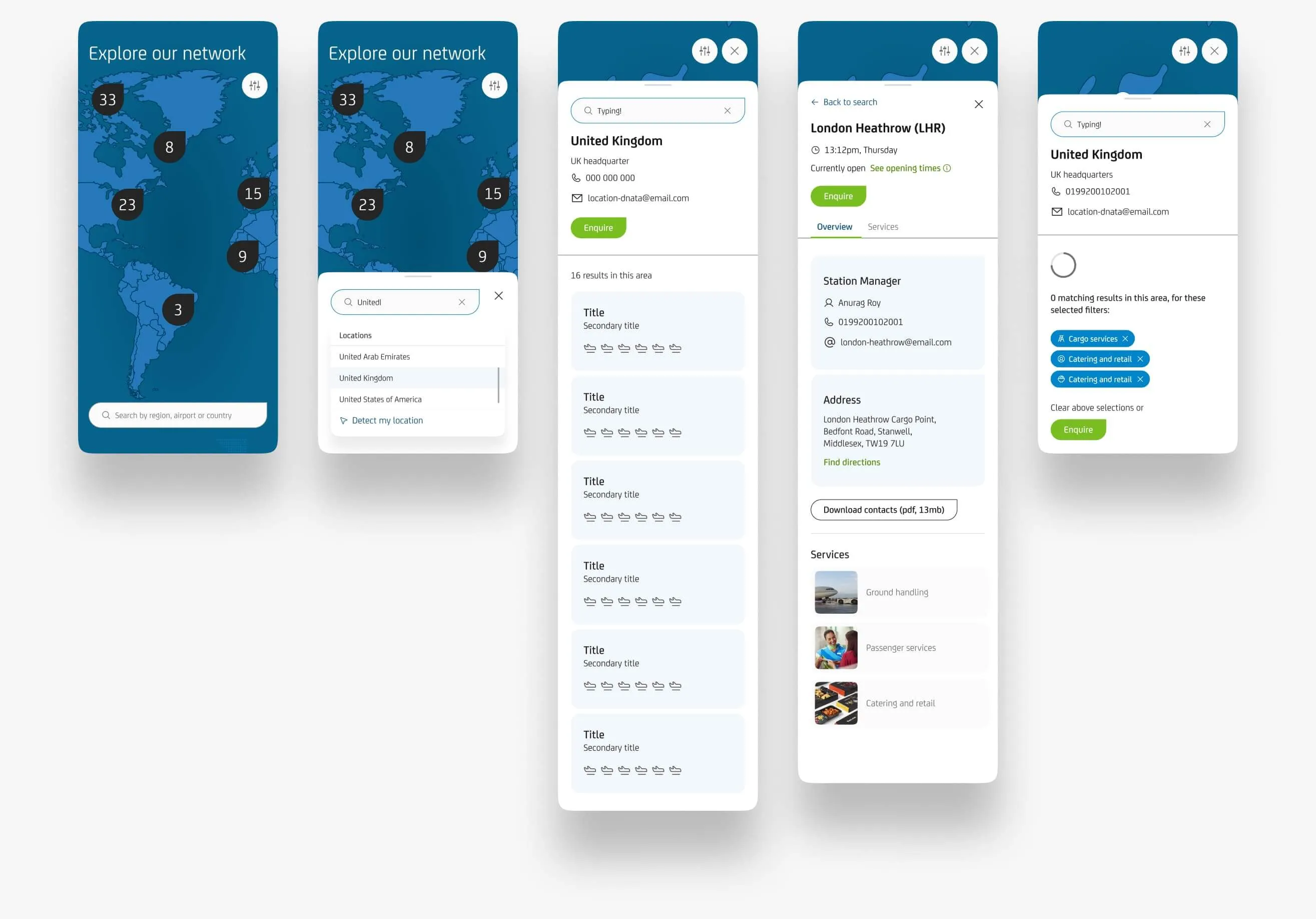
The network needed to do more than show where dnata operates. I designed it to help people move from a location to the services and information available there, making the map part of the navigation rather than just a visual feature.
The interaction was designed for both desktop and mobile, adapting how people explore locations while keeping the same information easy to reach on smaller screens.
UI Kit
Building a reusable foundation for the website to grow
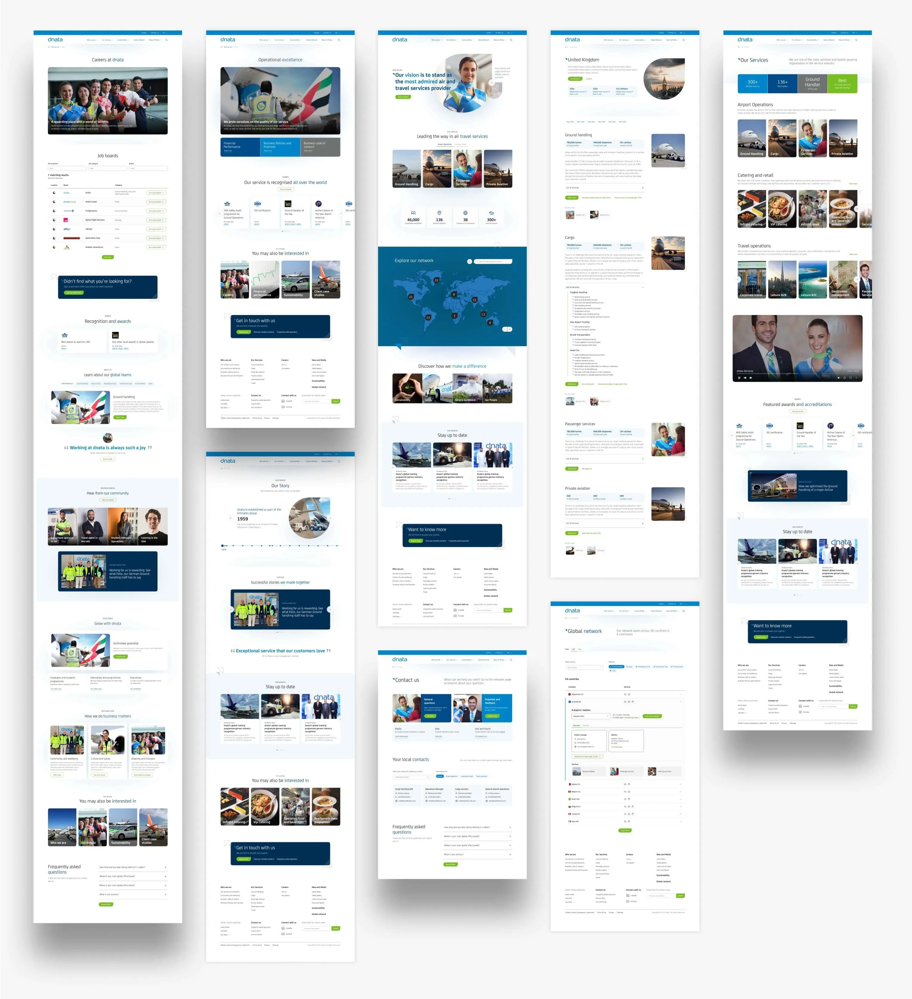
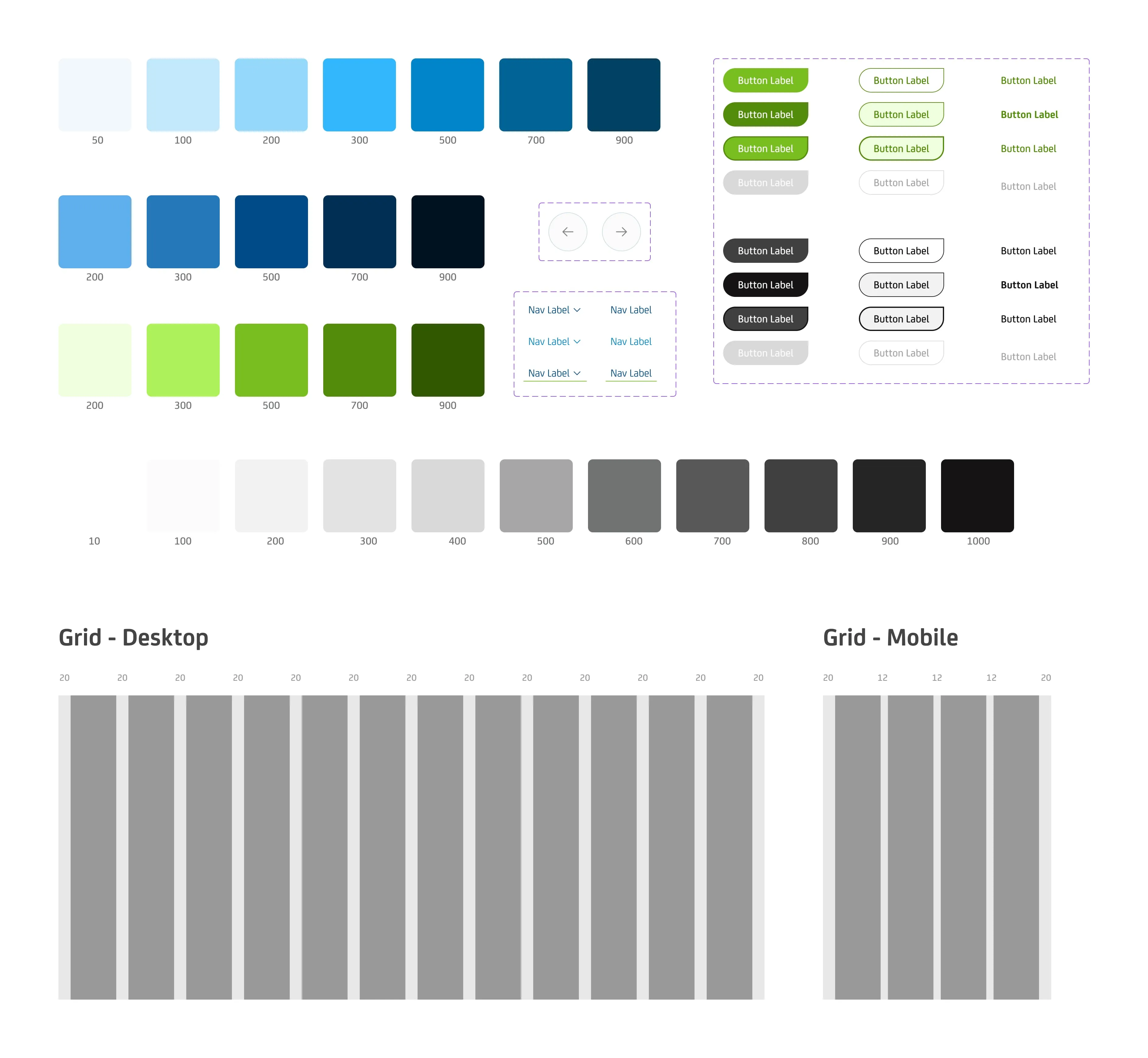
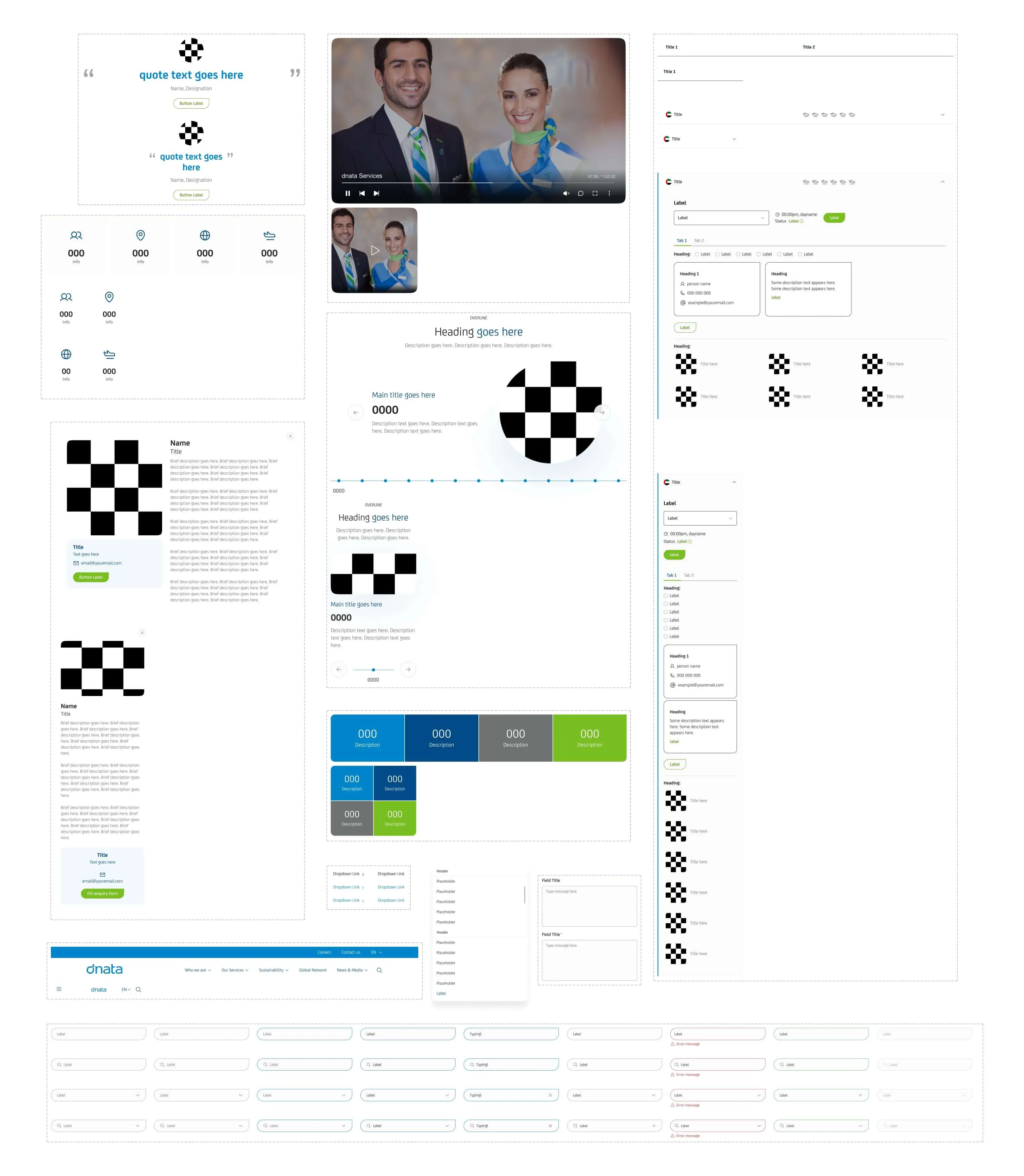
The redesign needed to work beyond the pages we were creating. I built a UI Kit around the shared patterns and components used across the website, giving the team a consistent foundation for future pages and updates.
Components were designed to work across desktop and mobile, so new content could be added without having to rethink the same interface decisions each time.
Components
Making reusable components flexible enough for different pages
The components needed to keep the experience consistent without forcing every page into the same layout. I designed them to handle different types and amounts of content while maintaining the same visual and interaction patterns.
The same building blocks could then be reused across desktop and mobile, making future pages easier to design while keeping the overall experience consistent.
The outcome
A clearer experience built to support dnata as it grows
The redesign brought dnata’s services, locations and global presence into a clearer experience across desktop and mobile.
Alongside the new interface, the reusable UI Kit gave the website a foundation for future pages and updates. What started as a website redesign became a more structured way for dnata to present a complex global business online.