Rethinking the ticket booking experience across web and mobile for Q-Tickets.
Q-Tickets needed to rethink its booking experience around the many choices that come with finding an event, selecting tickets and seats, and completing a purchase.
I worked across the website and mobile app, mapping the booking journeys and turning them into detailed user flows and high-fidelity wireframes for both platforms.
My role
UX Designer
Project for
Q-Tickets
Worked with
Brain Lake
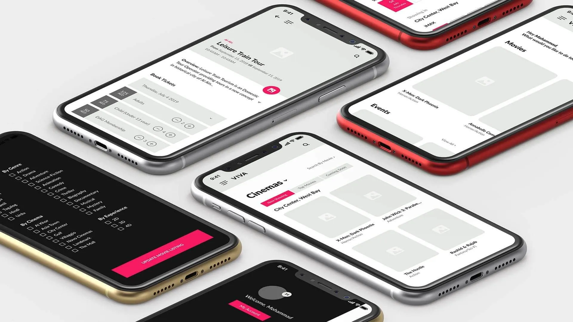
The challenge
Buying a ticket should feel simple, even when the journey behind it is not
Q-Tickets needed to make the booking experience easier to follow across both its website and mobile app. Users had to move from discovering an event to choosing tickets and completing their purchase without unnecessary friction.
The challenge was to simplify that journey while thinking through the different steps, decisions and interactions required on two platforms, before getting into the final interface.
Mapping the journey
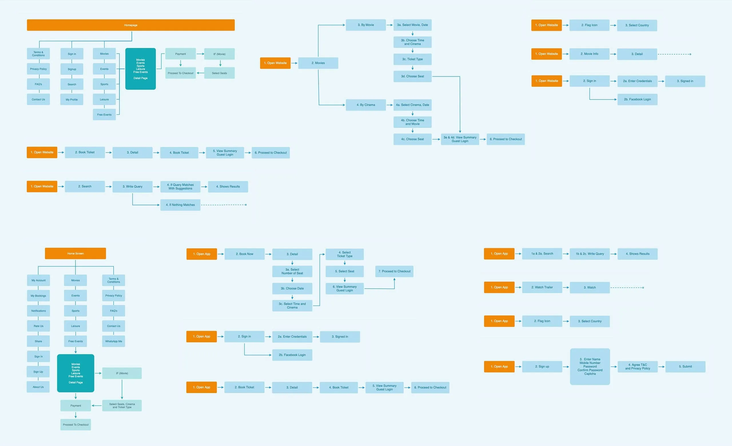
Before designing screens, I worked out how the whole booking journey should connect
I mapped the experience across the website and mobile app, from discovering an event through to purchasing a ticket.
Looking at the journey as a whole helped me understand where users needed to make decisions, what information they needed at each point, and how one step should lead naturally into the next. It gave me a clear structure to work from before moving into detailed wireframes.
Mobile experience
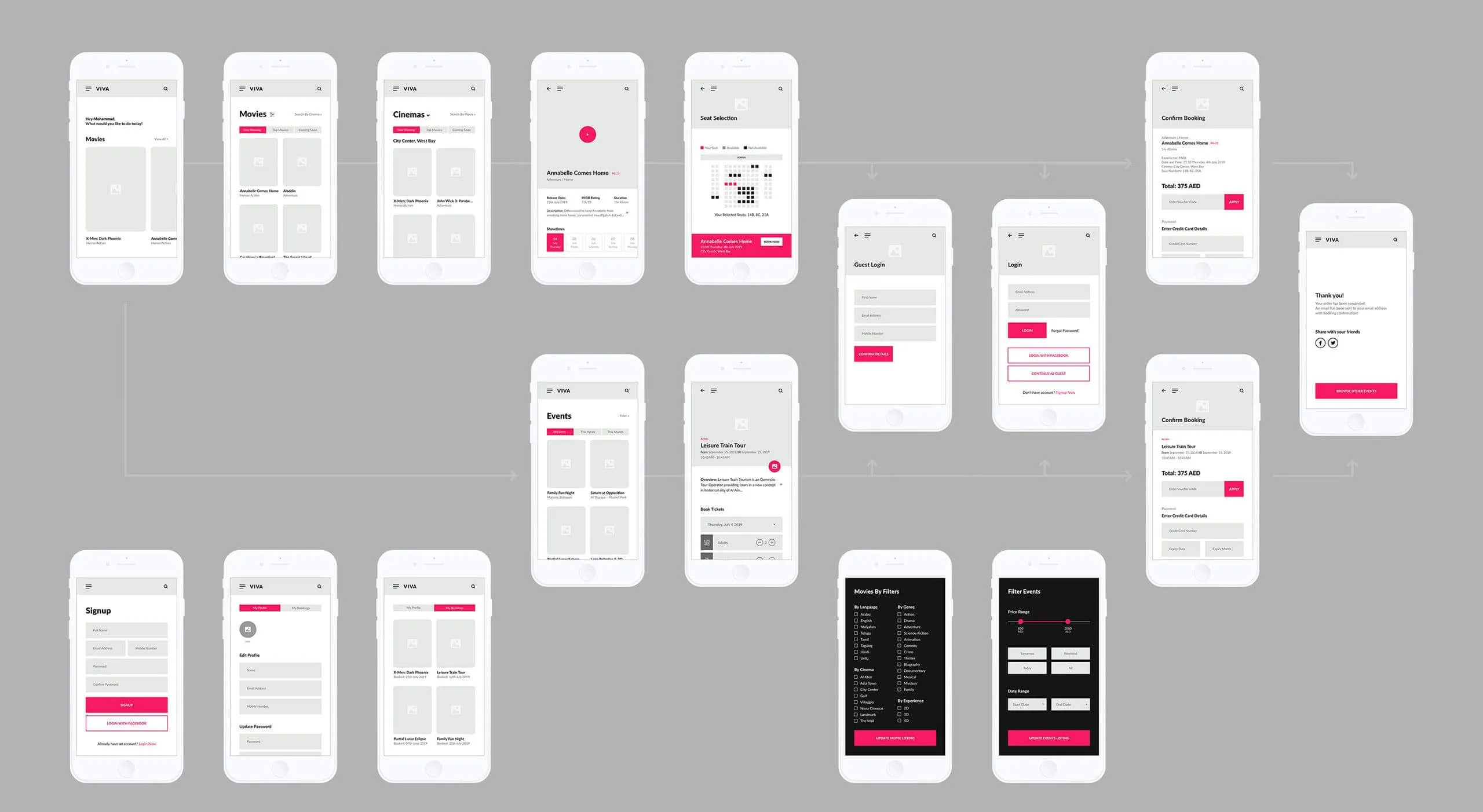
The mobile experience had to make a multi-step booking feel manageable
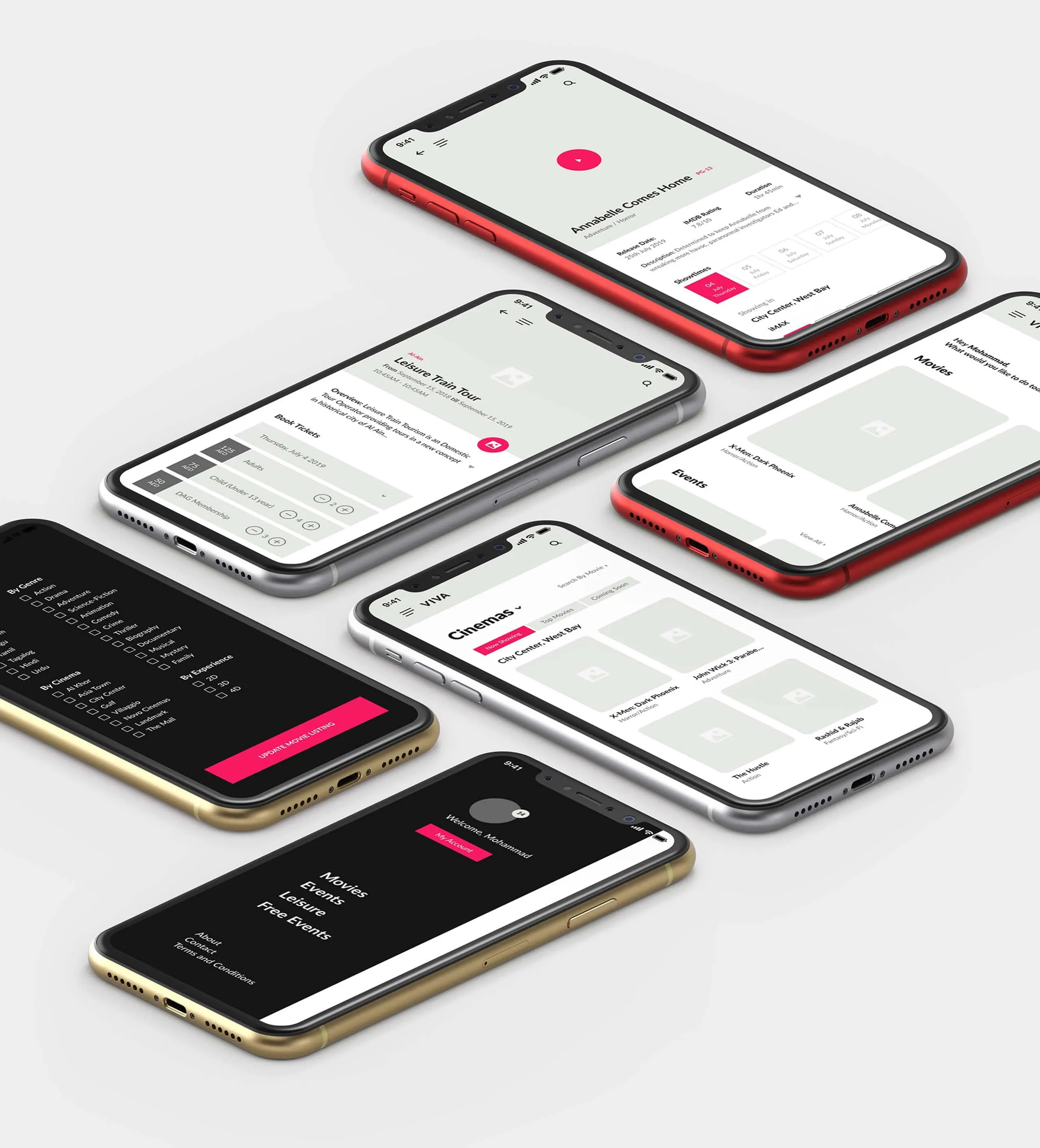
Once the overall journey was clear, I translated it into detailed mobile wireframes covering the key screens, navigation and interactions involved in buying a ticket.
The smaller screen meant being more deliberate about what users saw at each step. The wireframes helped define the hierarchy and progression of the experience before moving further into design and development.
Website experience
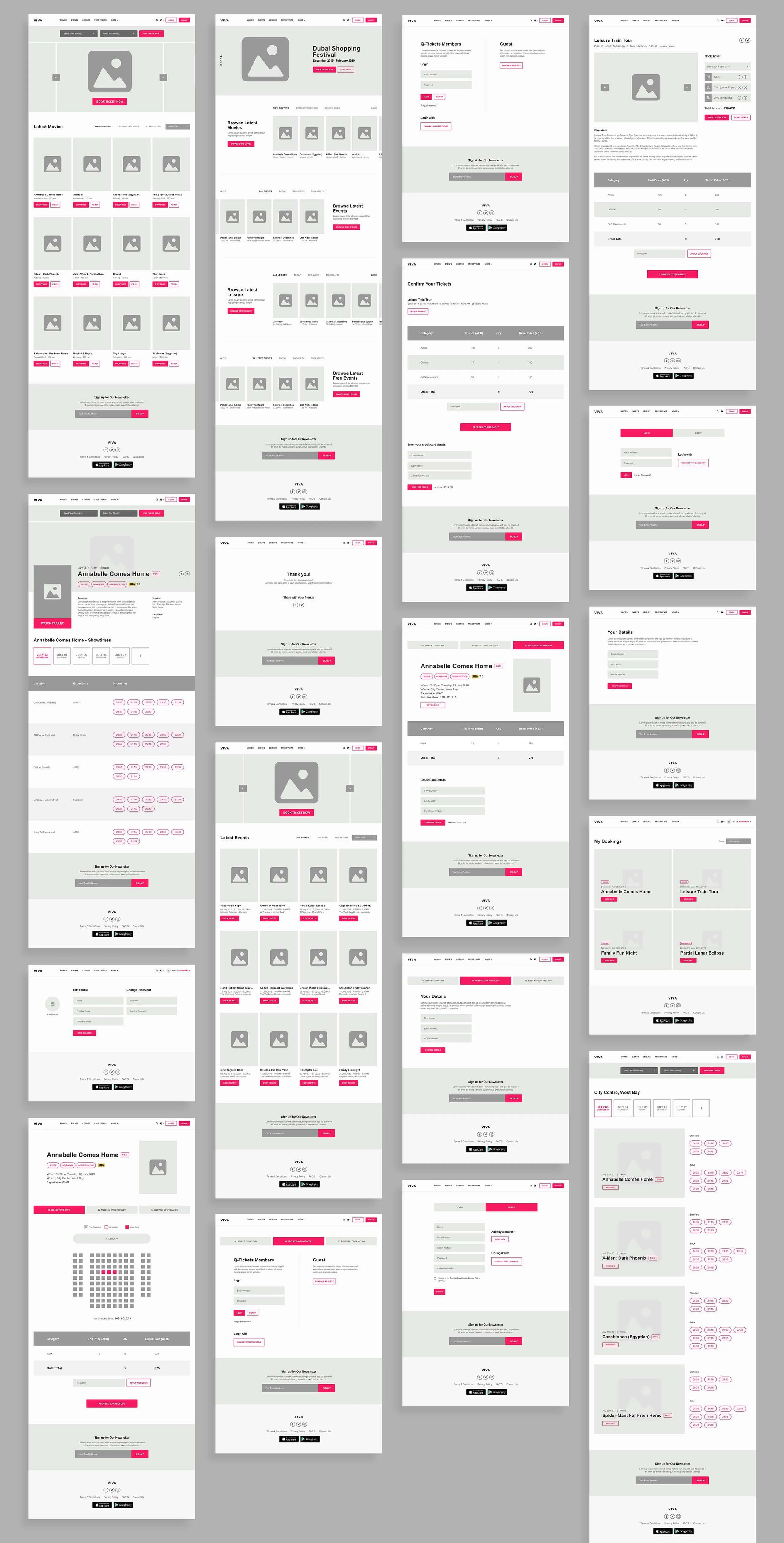
The same booking journey needed more room to work on larger screens
For the website, I adapted the journey to make better use of the additional space while keeping the same core booking logic as mobile.
The high-fidelity wireframes defined how content, navigation and booking actions would work across the key stages, giving the team a detailed blueprint for the website experience.
Bringing it together
Turning the journey into something the wider team could build from
The final wireframes brought the different parts of the experience together into a more complete view of the Q-Tickets product.
Rather than designing web and mobile separately, the work gave both platforms the same underlying booking journey while allowing each one to use the space differently.