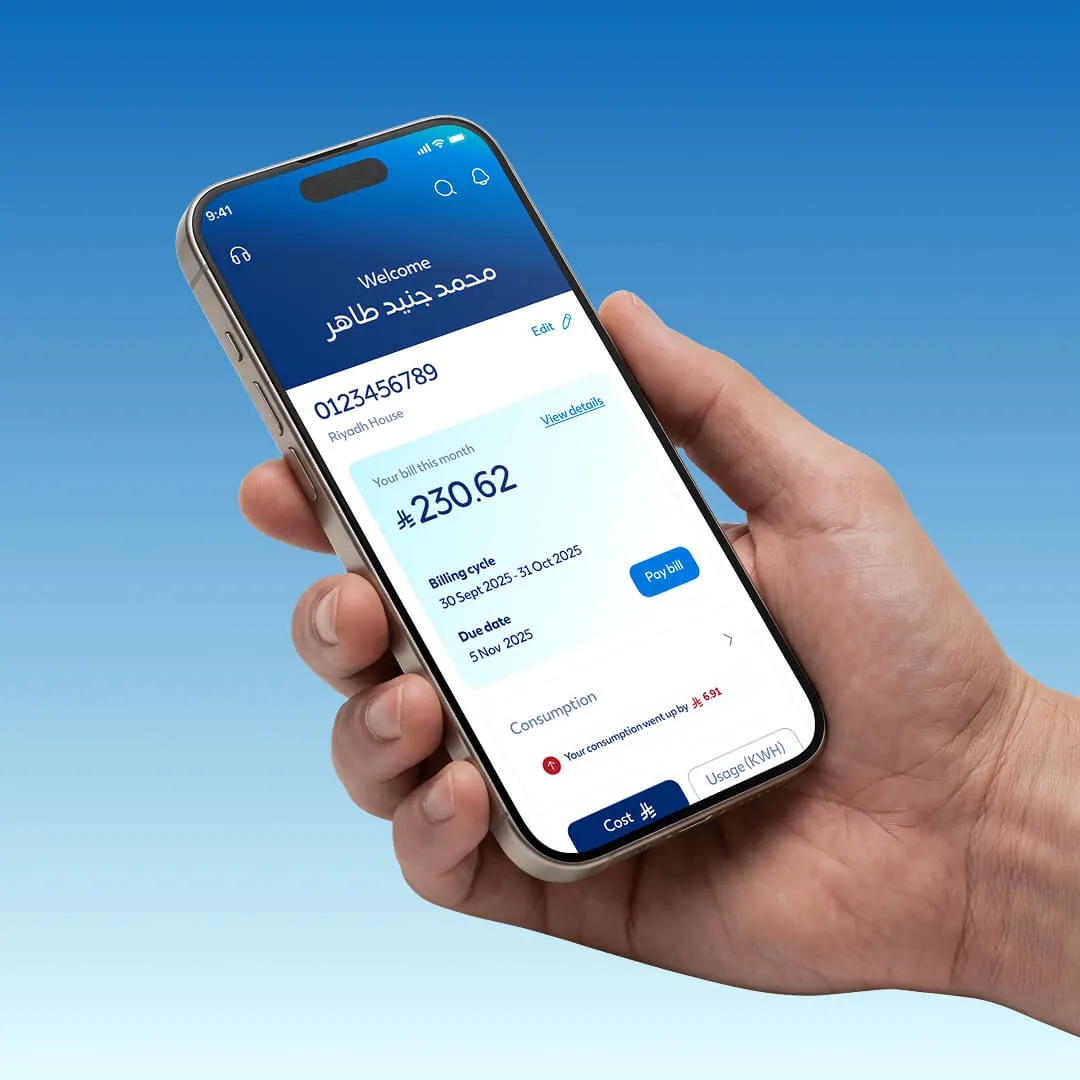
Making complex electricity fee calculations easier to understand and use.

Saudi Energy needed a simpler way for customers to estimate fees for new connections, additional meters and upgrades before starting a service request.

I designed the UI from the ground up across web, responsive mobile and app, working closely with the UX designer and development team to turn complex service flows into a clear experience.

My role

UI Designer

Project for

Saudi Energy

Worked with

Horizontal Digital

About the project

One calculator for three different service needs

The Fees Calculator helps customers understand the estimated cost before starting an electricity service request.

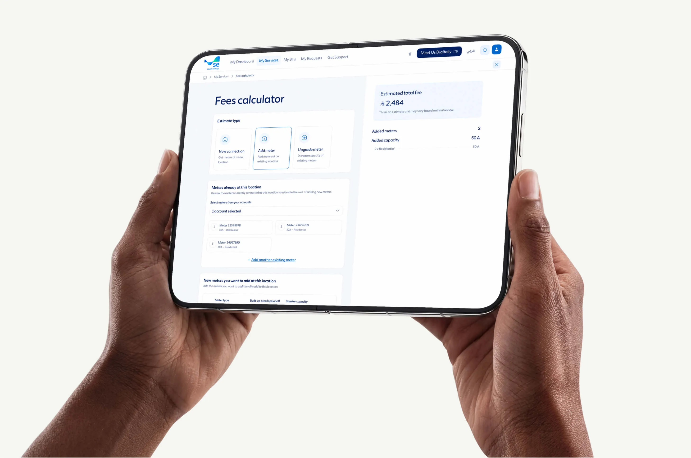
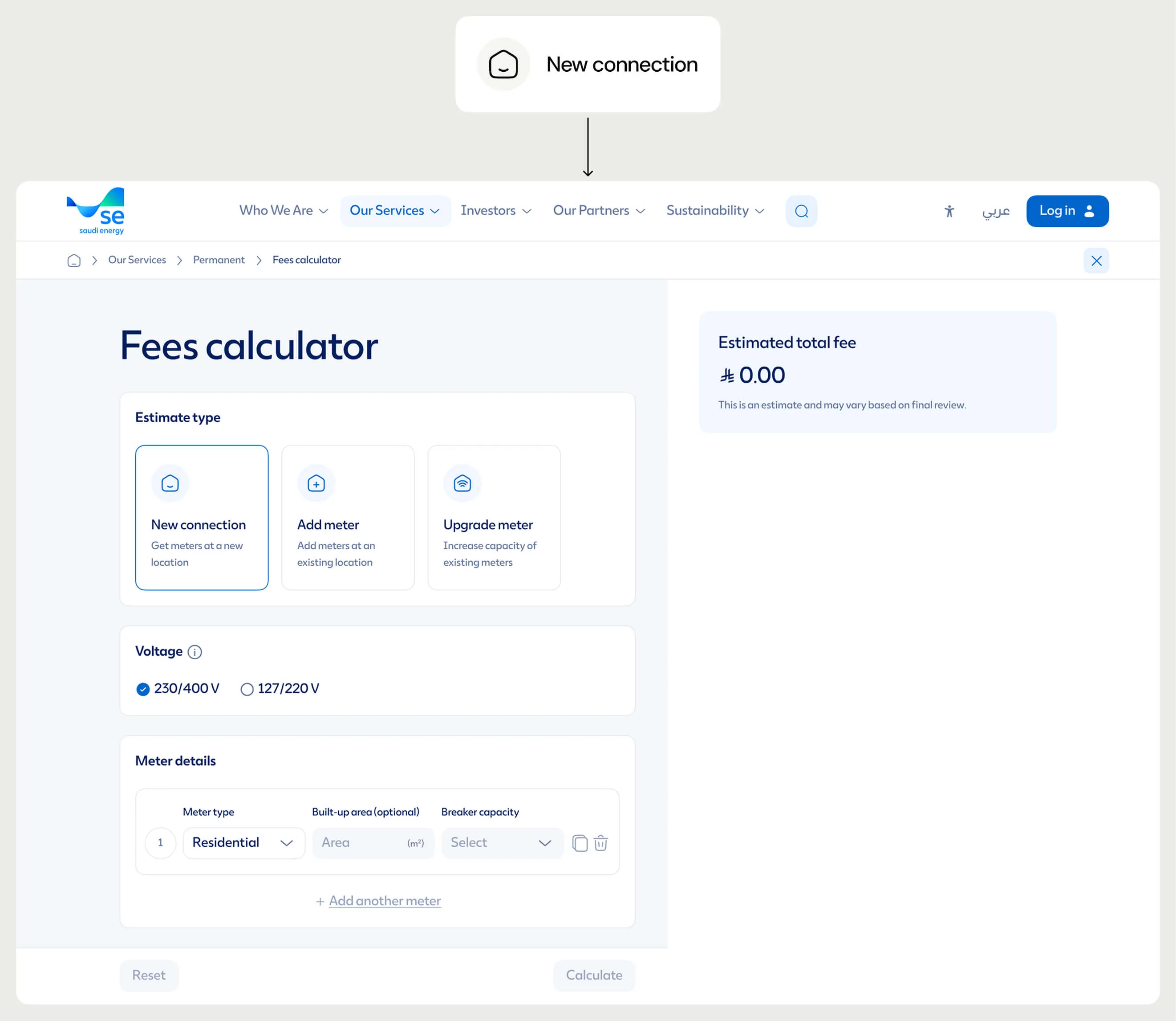
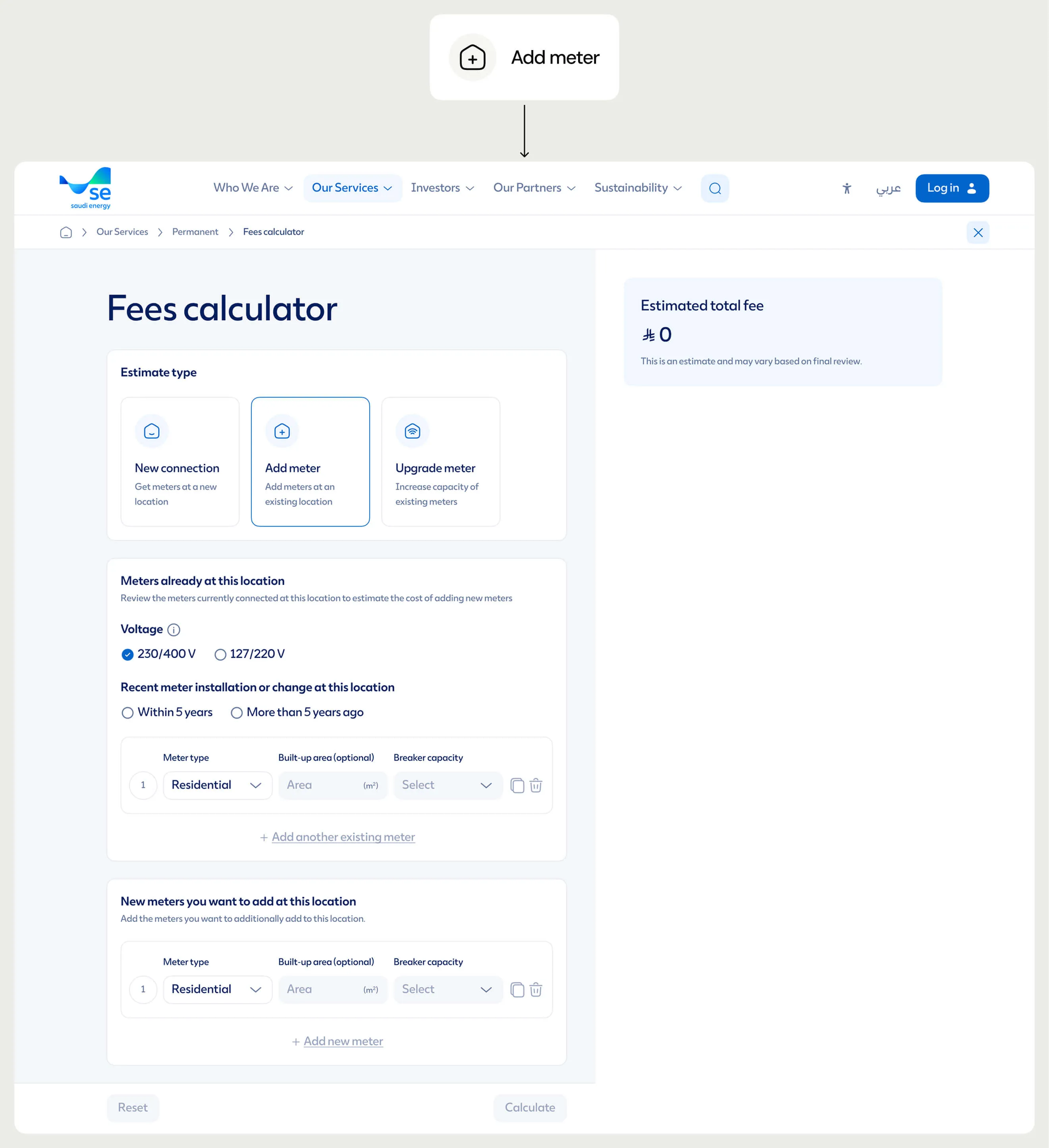
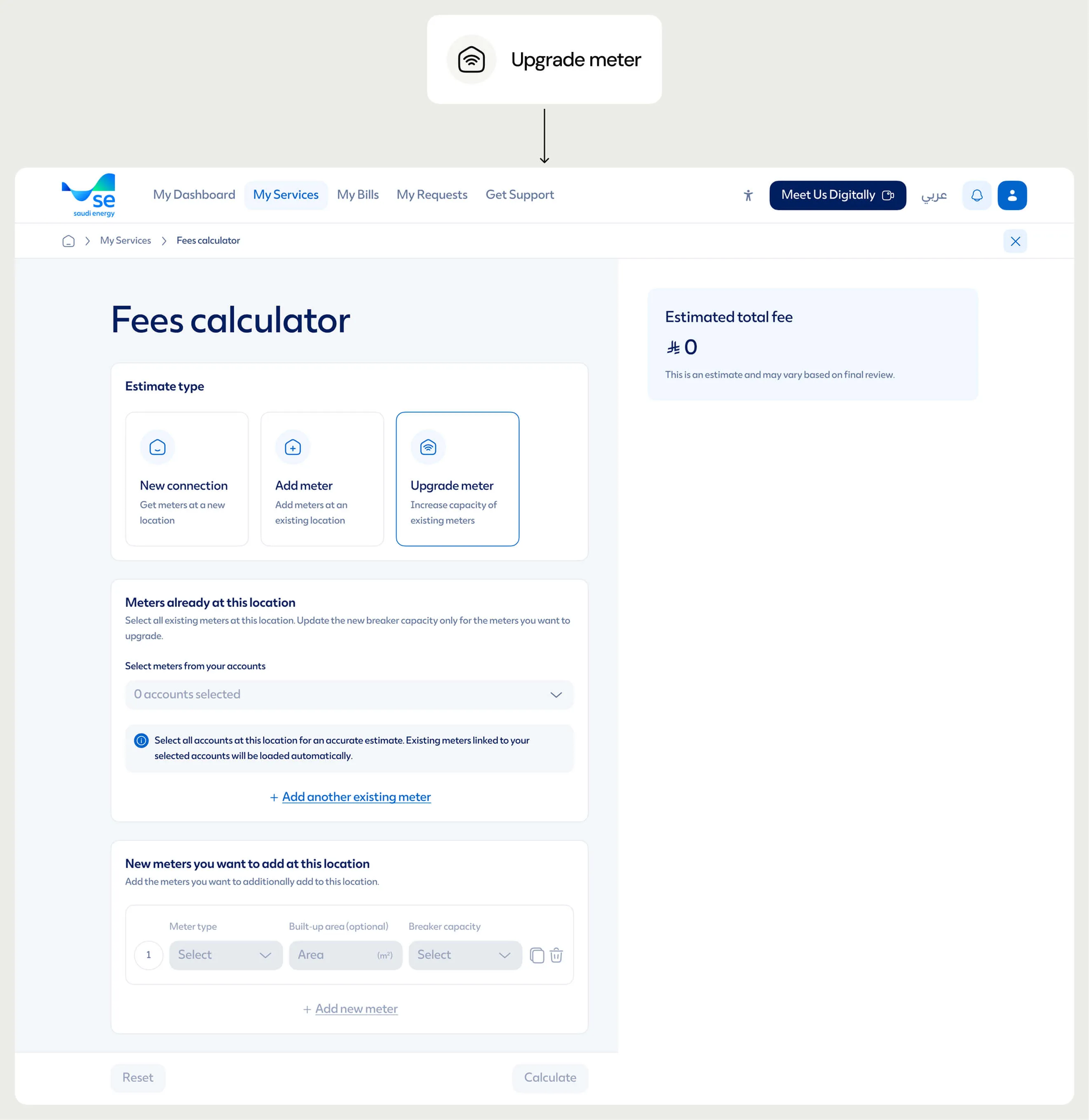
It covers three main journeys: getting a new connection, adding meters to an existing location, and upgrading the capacity of existing meters. Customers enter the details relevant to their request and get an estimated fee along with a breakdown of meters and capacity.

The experience was designed across web, responsive mobile and app, including entry points within the existing Saudi Energy service experience.

The challenge

There were a lot of scenarios to consider

Different requests needed different information, from voltage and meter type to built-up area, breaker capacity, existing meters and account details.

Then there were all the different combinations: one meter or many, multiple accounts, different meter types, existing and new meters, capacity upgrades, and even cases where customers were adding meters while upgrading others.

The UI needed to handle all of this without making the calculator feel as complicated as the logic behind it.

Three journeys

Starting with what the customer needs to do

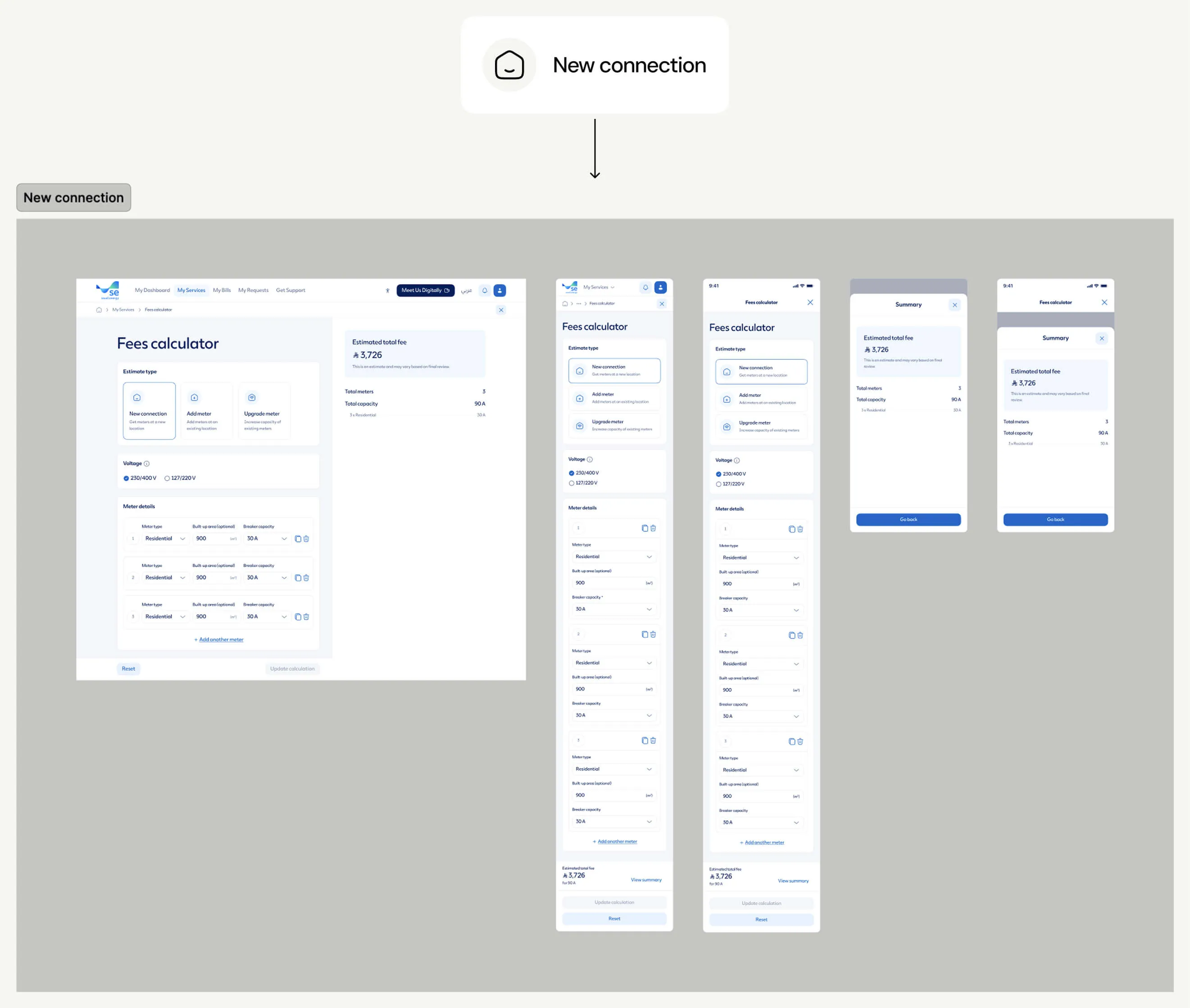
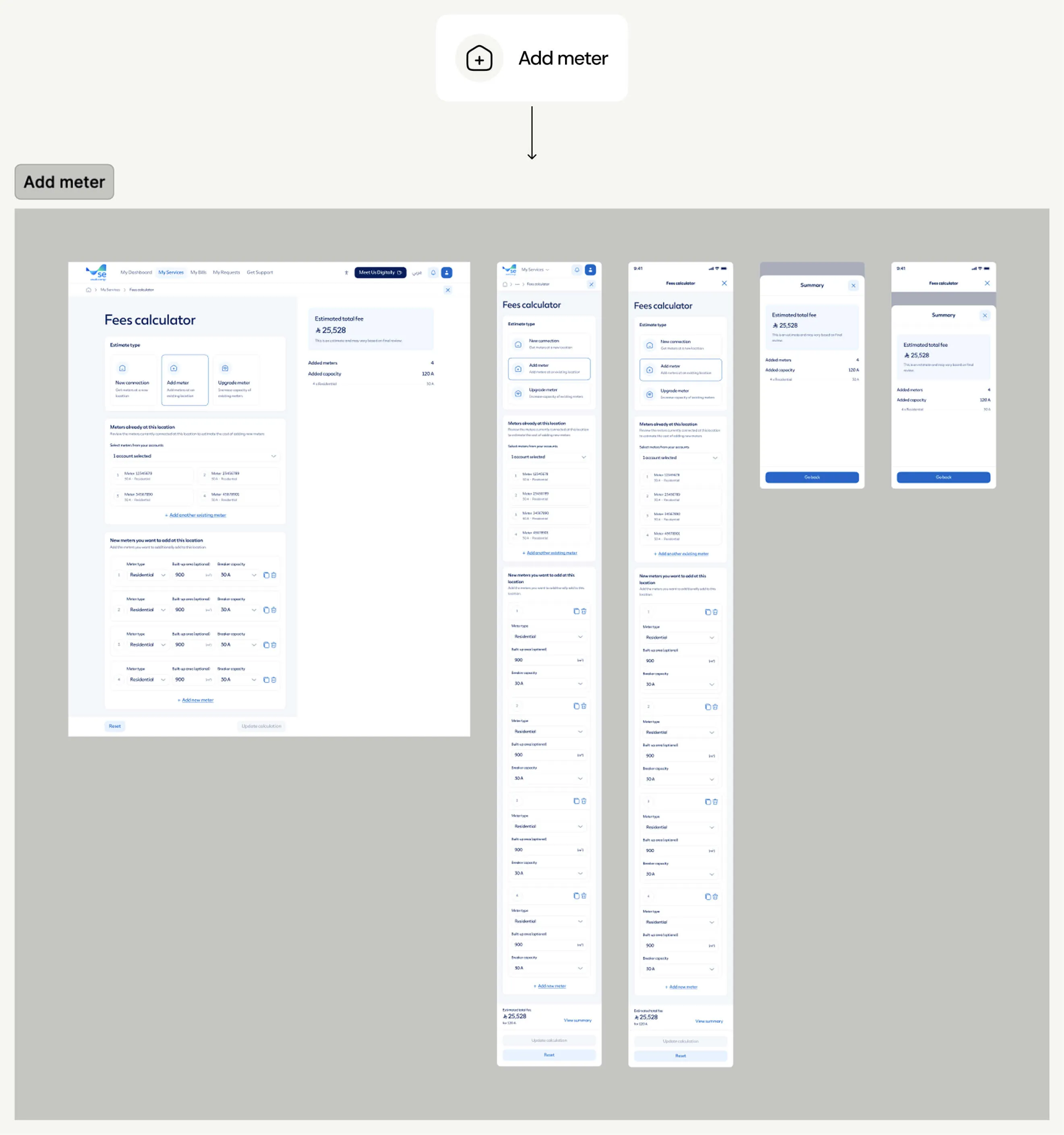
The calculator starts by asking customers what they want to estimate: a new connection, adding meters, or upgrading existing meters.

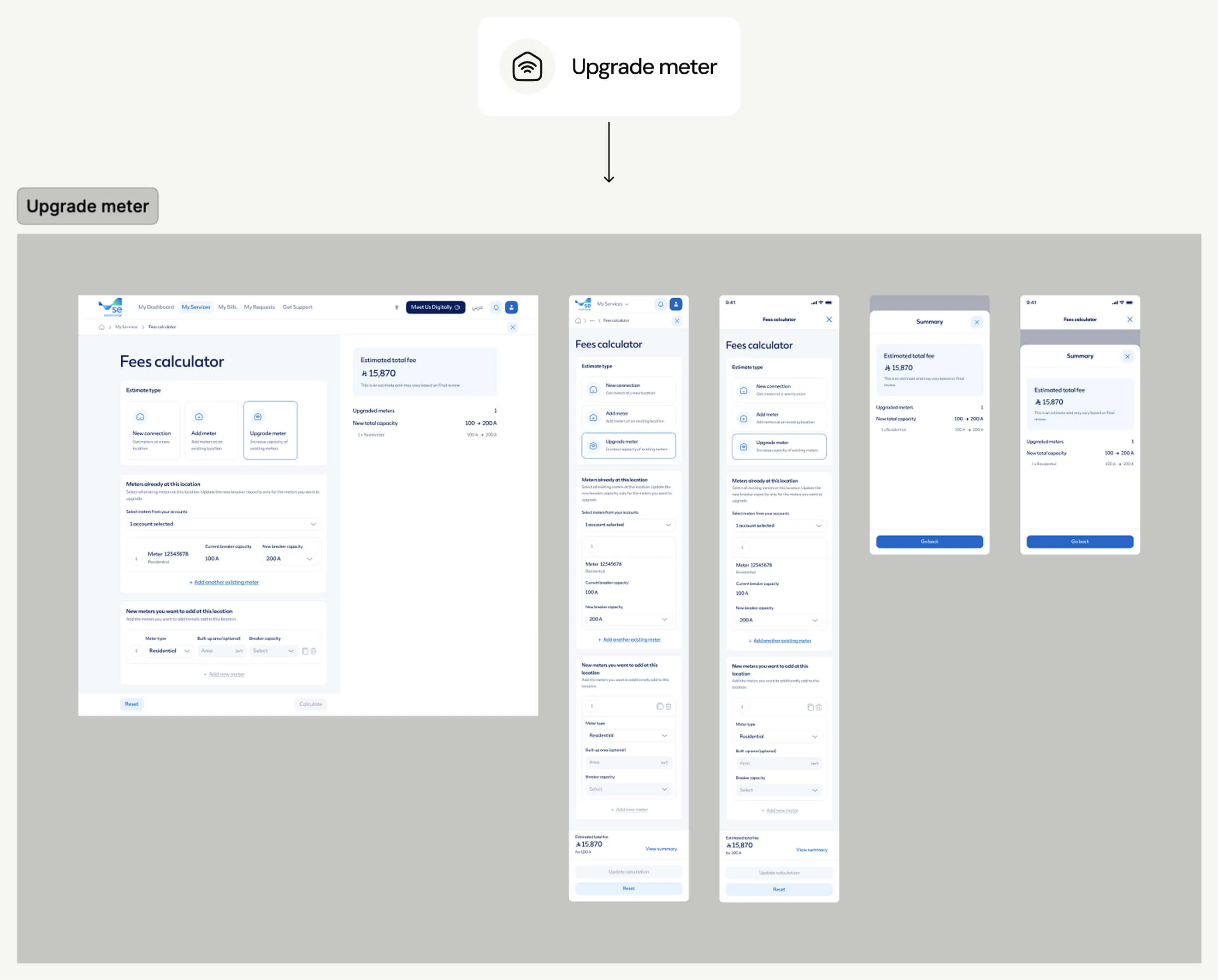
Each journey follows the same overall design language, but the information changes based on the request. A new connection starts with voltage and new meter details, while adding or upgrading meters brings existing accounts and meters into the experience.

Using the same overall structure meant each journey could handle different information without feeling like a completely different product.

Meter design

Making each meter easier to understand

Meters were at the centre of every journey, but the information customers needed to see or enter changed depending on what they were doing.

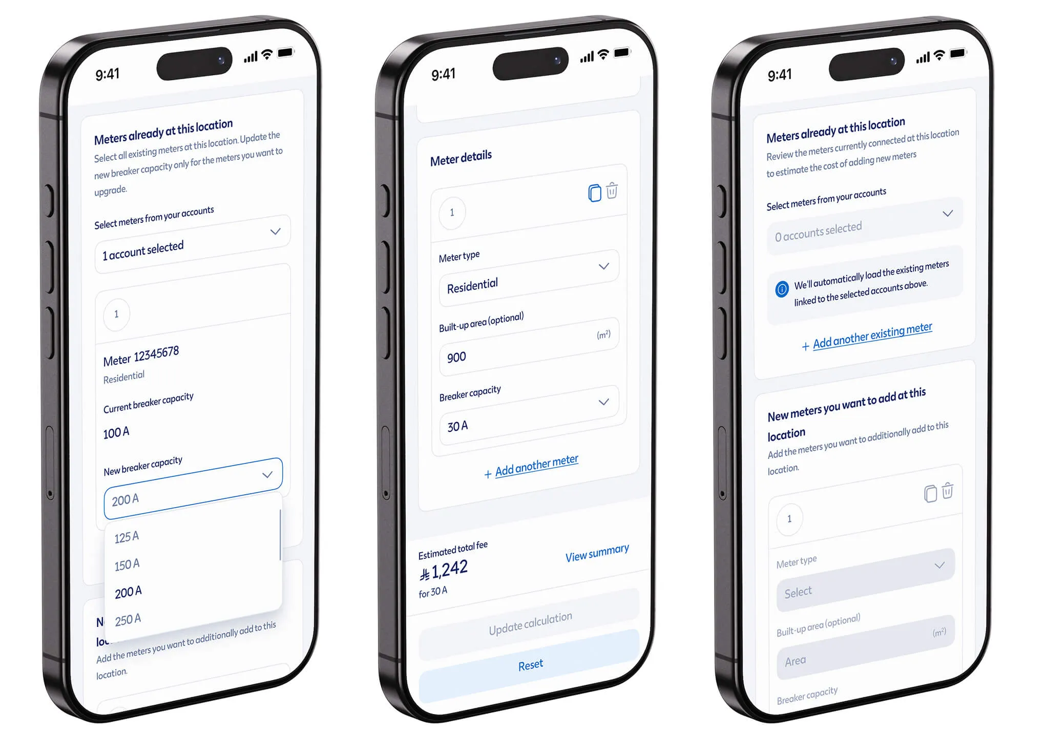
I designed a consistent card structure that could adapt to new, existing and upgraded meters while keeping the important details easy to scan. As customers added more meters, the same pattern could repeat without turning the page into a long collection of unrelated fields.

For upgrades, the interface also made the current and new breaker capacity clear, so customers could quickly see what was changing and leave other meters unchanged.

Estimate summary

Keeping the estimate within reach

As customers added or changed meters, the estimate needed to remain easy to check without getting in the way of the form.

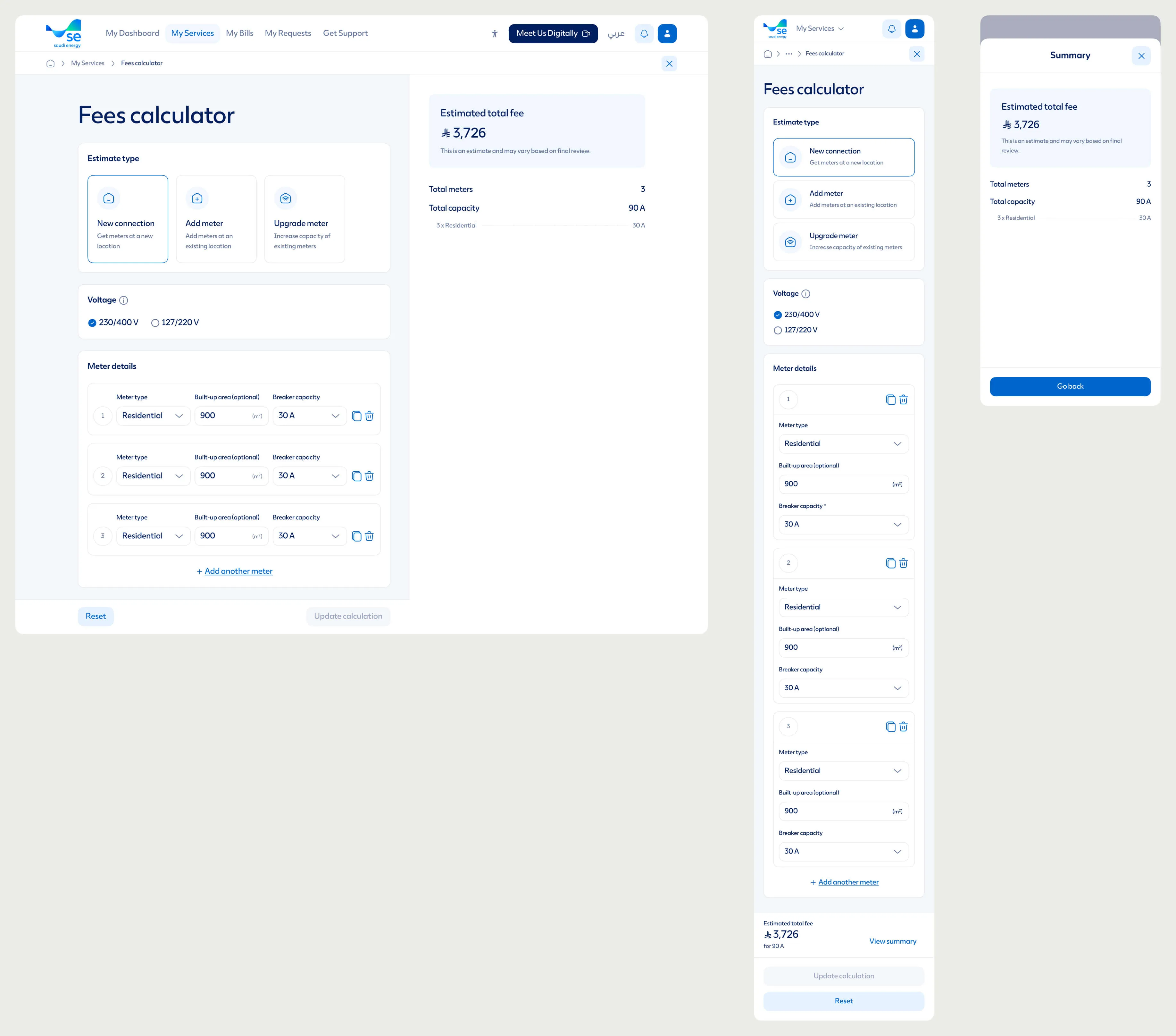
On web, I used the available space to keep the summary alongside the form, showing the estimated fee, number of meters, capacity and relevant breakdowns. For responsive mobile and app, the same information was adapted into a more compact summary that customers could open when needed.

The content also changed with the journey, so customers saw things like total capacity for a new connection, added capacity when adding meters, or the change in capacity when upgrading.

Across screens

The same experience across different screens

The goal across web, responsive mobile and app was to keep the experience familiar while adapting it to the space available, rather than simply shrinking the desktop layout.

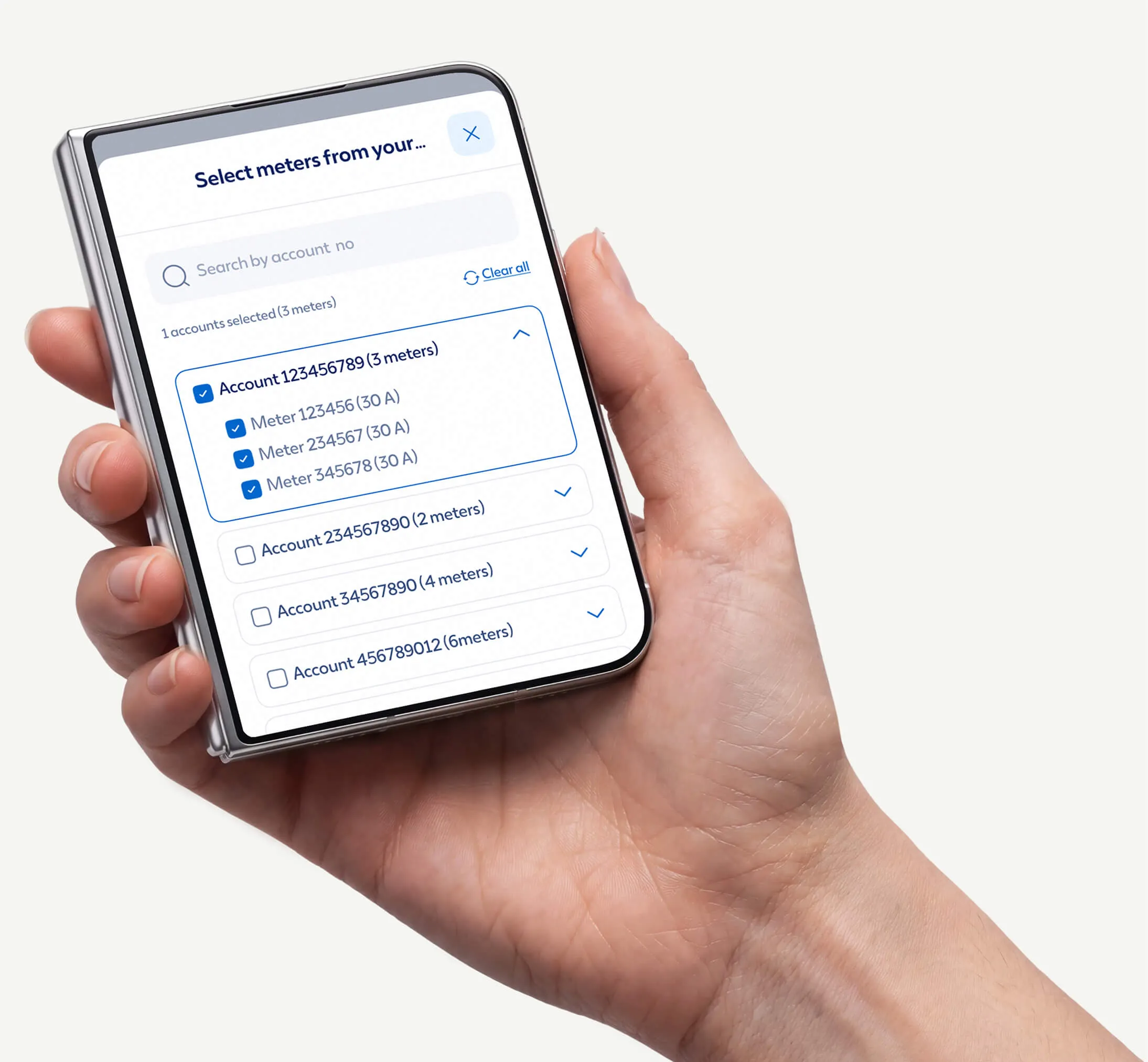
Long forms, meter cards, account selection and summaries all needed different treatments on smaller screens. On desktop, more information could stay visible together. On mobile and app, the layout became more focused, with actions and summaries available when customers needed them.

States and scenarios

Designing for more than the main flow

Once the main screens were in place, a lot of the work was in the details and less obvious scenarios.

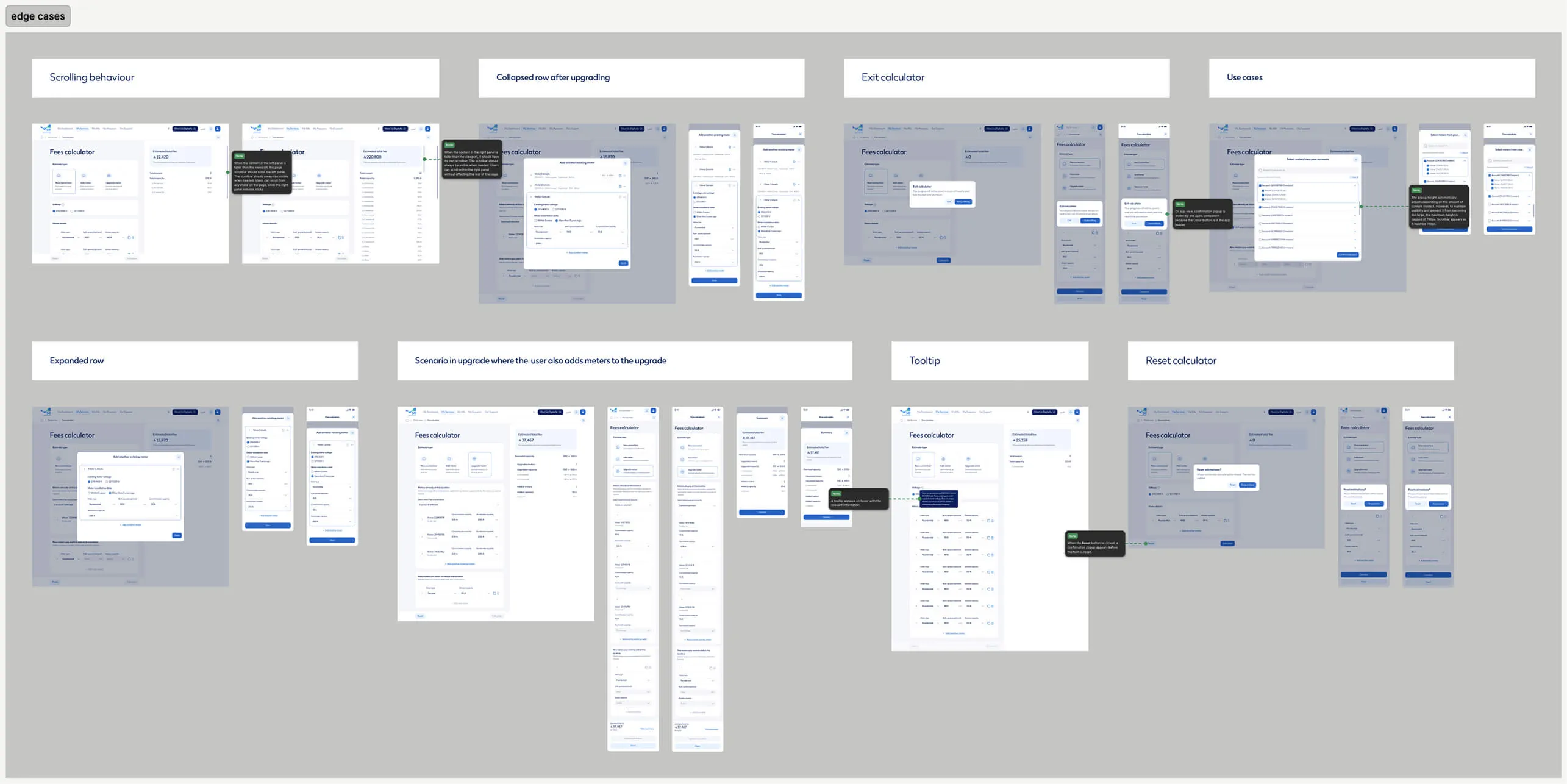
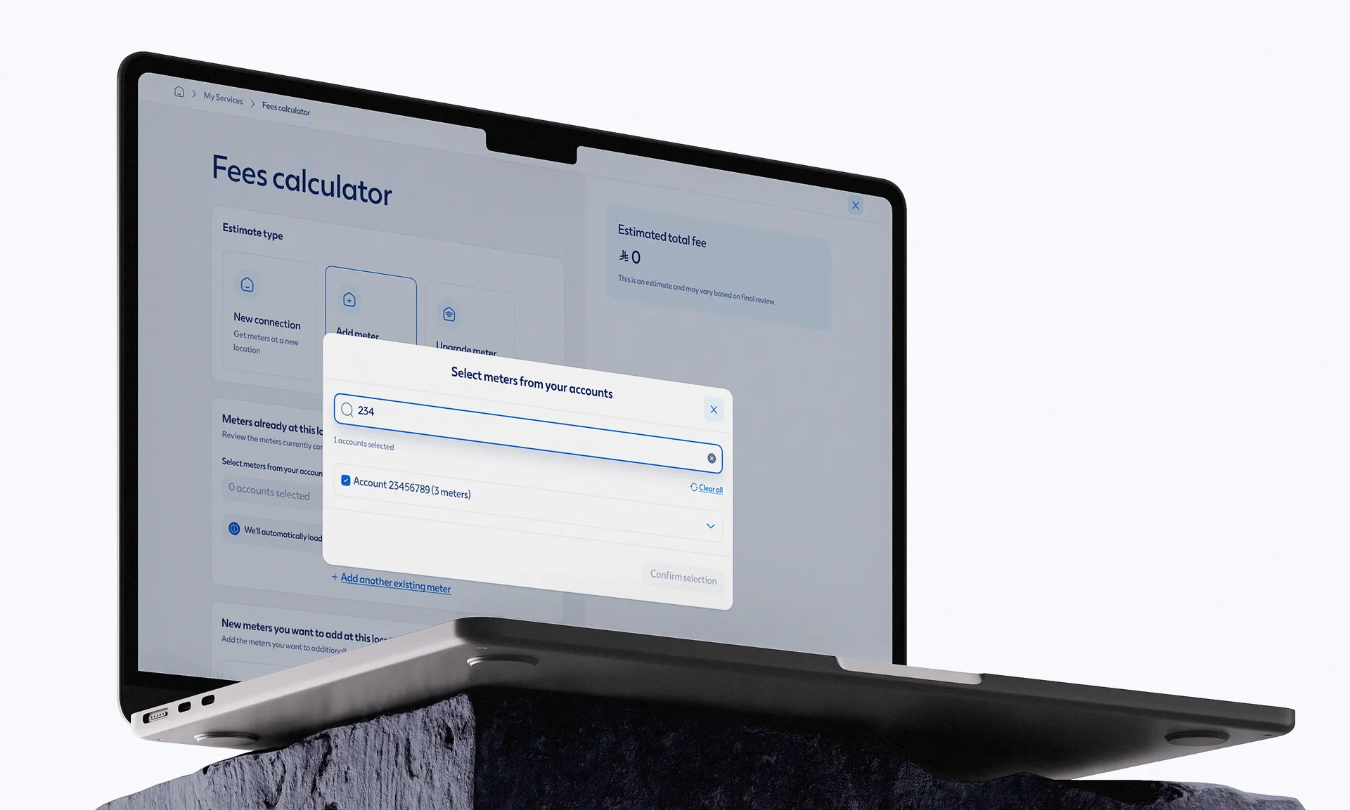
I designed states for validation, account selection, no search results, long meter lists, tooltips, reset and exit actions, and different combinations of existing, new and upgraded meters. Some journeys could also overlap, such as upgrading existing meters while adding new ones at the same time.

Working through these states helped make sure the interface still made sense when customers moved away from the simplest path.

Developer handoff

Bringing it all together for development

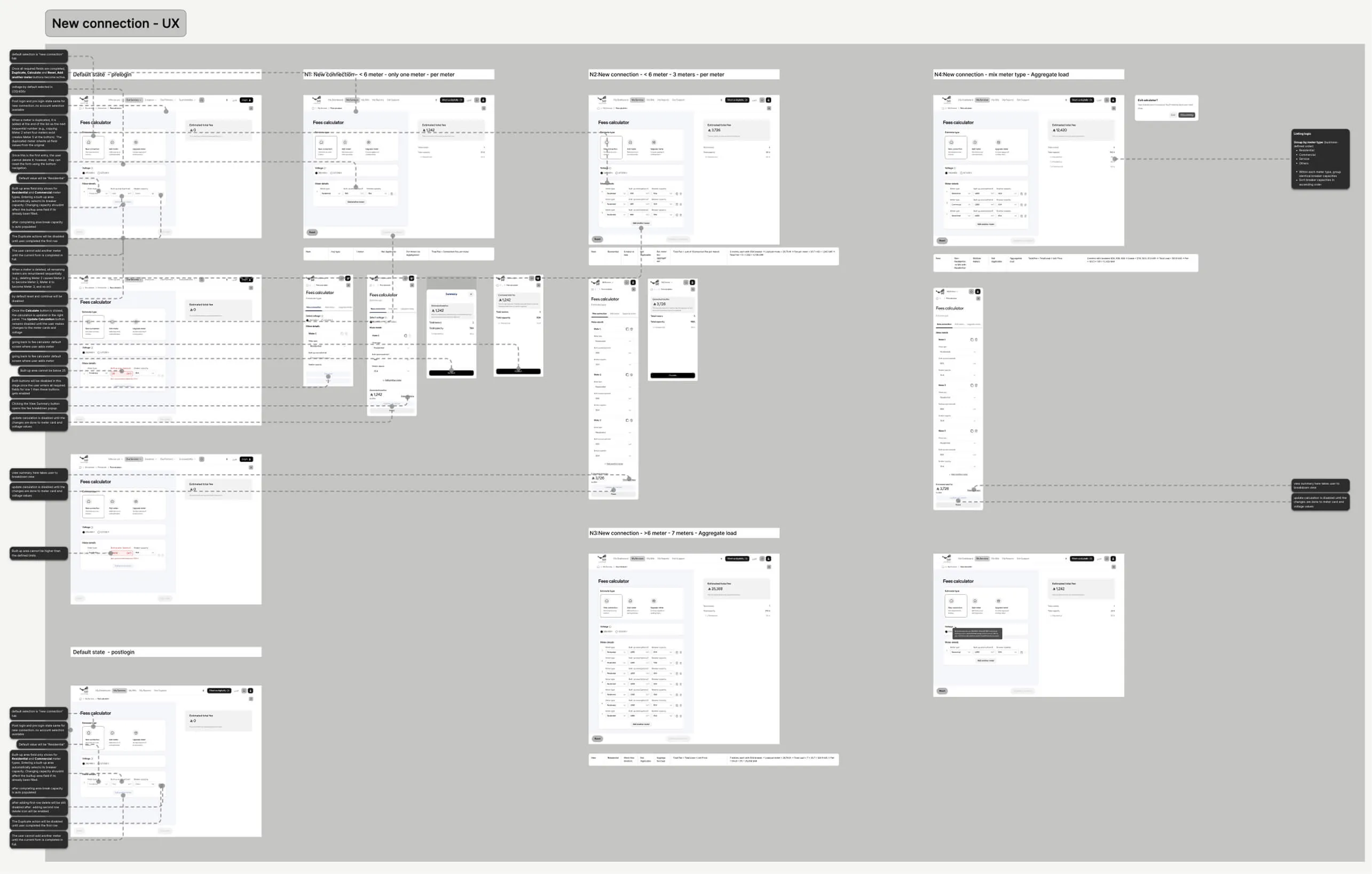
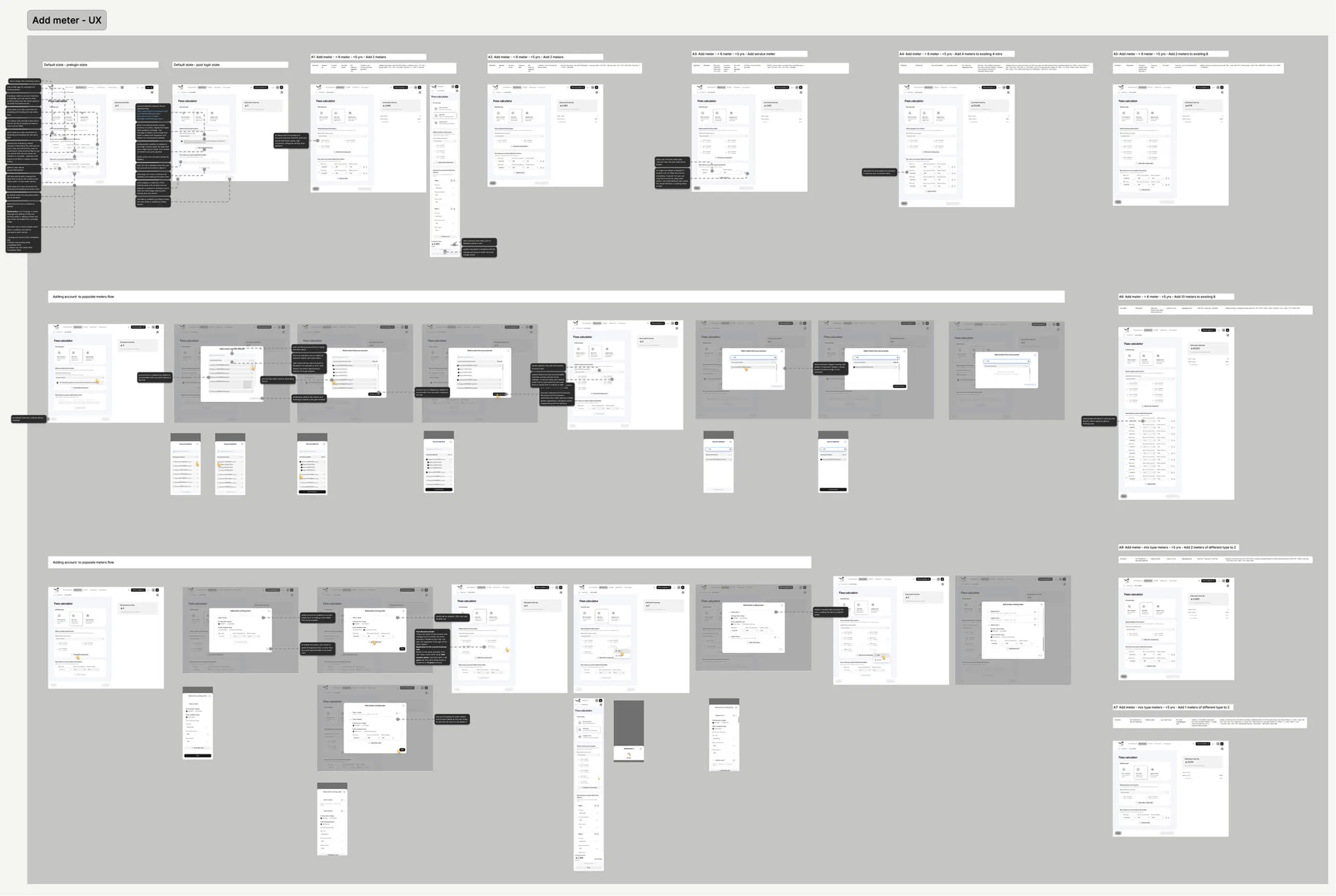
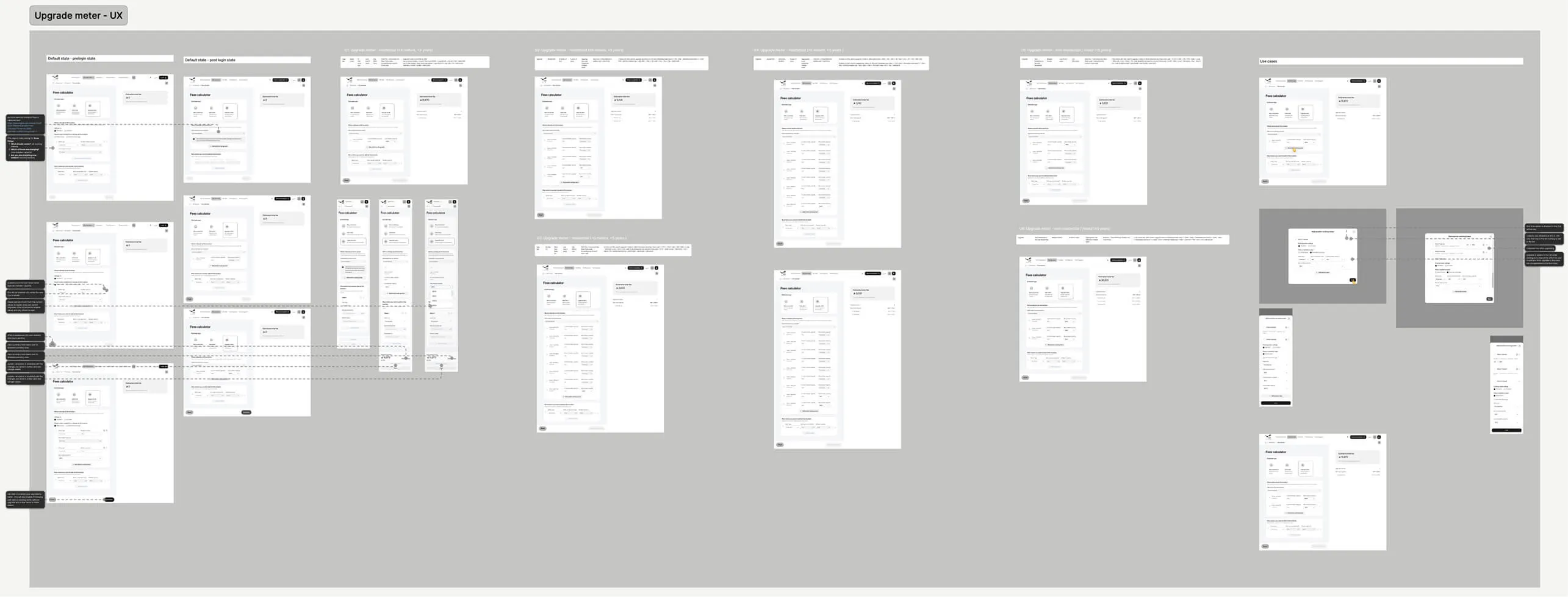
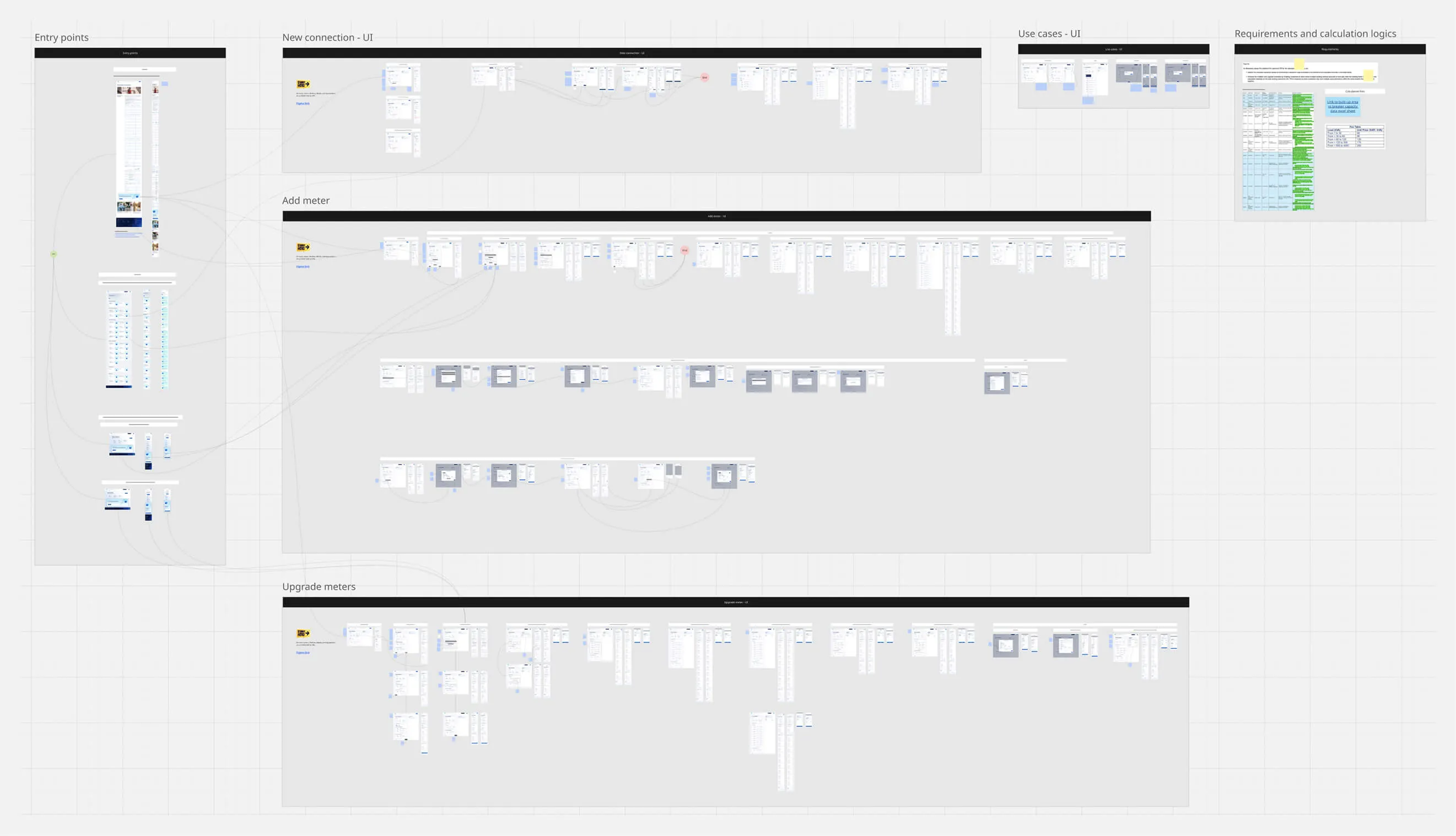
With three journeys, three platforms and a lot of different states, handing over individual Figma screens would not have been enough.

We exported the final designs into Miro and organised them into complete flows, connecting screens with arrows and heavily annotating the interactions, behaviours and decisions along the way. This gave developers one place to follow each journey from start to finish and understand what should happen at each step.

The result was a much clearer handoff, with the full journey, edge cases and expected behaviour documented in one place rather than spread across individual screens and conversations.

The outcome

A simpler experience for a complicated service

The final calculator brought New Connection, Add Meter and Upgrade Meter into one experience, while still handling the different information and scenarios each journey required.

Every key screen and state was designed across web, responsive mobile and app, with the complete flows documented and prepared for development.

I had the pleasure of working with Farhan as part of the same design team, and I was consistently impressed by his strong UI design skills and deep expertise in design systems.

Farhan brings a great balance of visual craft, attention to detail, and systems thinking to his work. He has a strong understanding of how to create scalable, consistent, and maintainable design solutions rather than designing individual screens in isolation. His ability to work with components, patterns, and design system principles makes him a valuable asset to any product design team.

Beyond his design expertise, Farhan is a great team player and collaborator. He is open to feedback, thoughtful in his approach, and committed to maintaining a high standard of design quality. I would highly recommend Farhan to any team looking for a senior UI designer with strong design system expertise and a collaborative mindset.

Zeeshan Khalid
Zeeshan Khalid DesignOps Lead at Horizontal Digital